WorkPassion project
Hops, Heart and Hues
Rebel Brewing — Twinkle Toes Hazy IPA
Building an inclusive craft-beer brand, from first sticky note to six-pack.
A personal concept project: Rebel Brewing is a brand I invented, not a real brewery.
- Mission
- Craft beer is full of brands that look like they’re for the same few people. Rebel Brewing set out to be for everyone else: playful, unbound and openly inclusive, starting with its first beer, Twinkle Toes Hazy IPA.
- Outcome
- A complete identity, from a winged-hop mark, a type system and a brand personality to a can and six-pack carrier fronted by a cast of characters, plus the dielines to print them.
- Impact
- A brand with a clear point of view, where every touchpoint says “we see you” and the can is art you can sip from.
Services
Strategy
Winning Hearts & Minds
Rebel Brewing started as a personal project in a crowded category. I wanted a brand that felt unique, playful and slightly rebellious, for the not-so-average beer drinker looking for something different.
The audience was clear: unconventional, fun-loving people who appreciate a well-made brew but don’t take themselves too seriously. People who embrace their inner rebel and care about inclusivity. The brand had to stand out on a shelf and feel like a welcome sign.
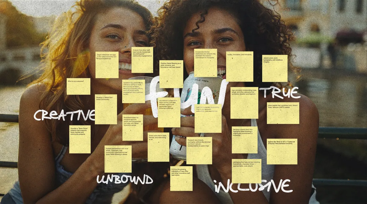
Brainstorm: quantity first, everything on a sticky.
Research
Someone Who Wants to Be Known
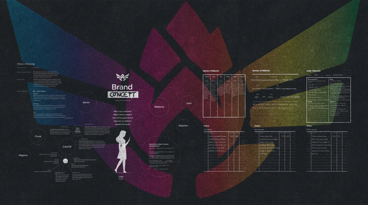
First I needed to understand the market and the people in it. I worked through demographics, psychographics and trends to build a profile of the ideal drinker: someone who wants a beer as bold in spirit as it is in taste, isn’t your average beer drinker, and wants to be known.
The Mark
A Mark Is Born
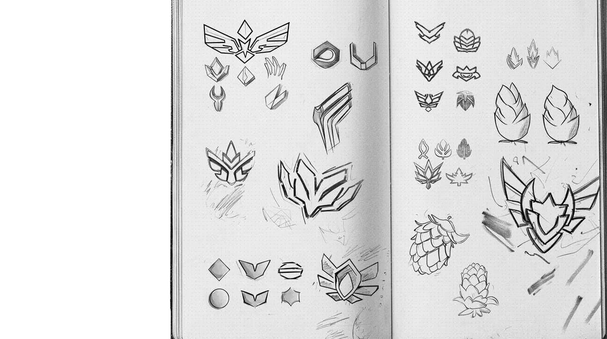
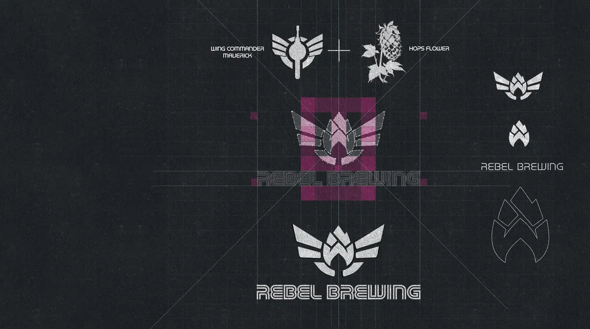
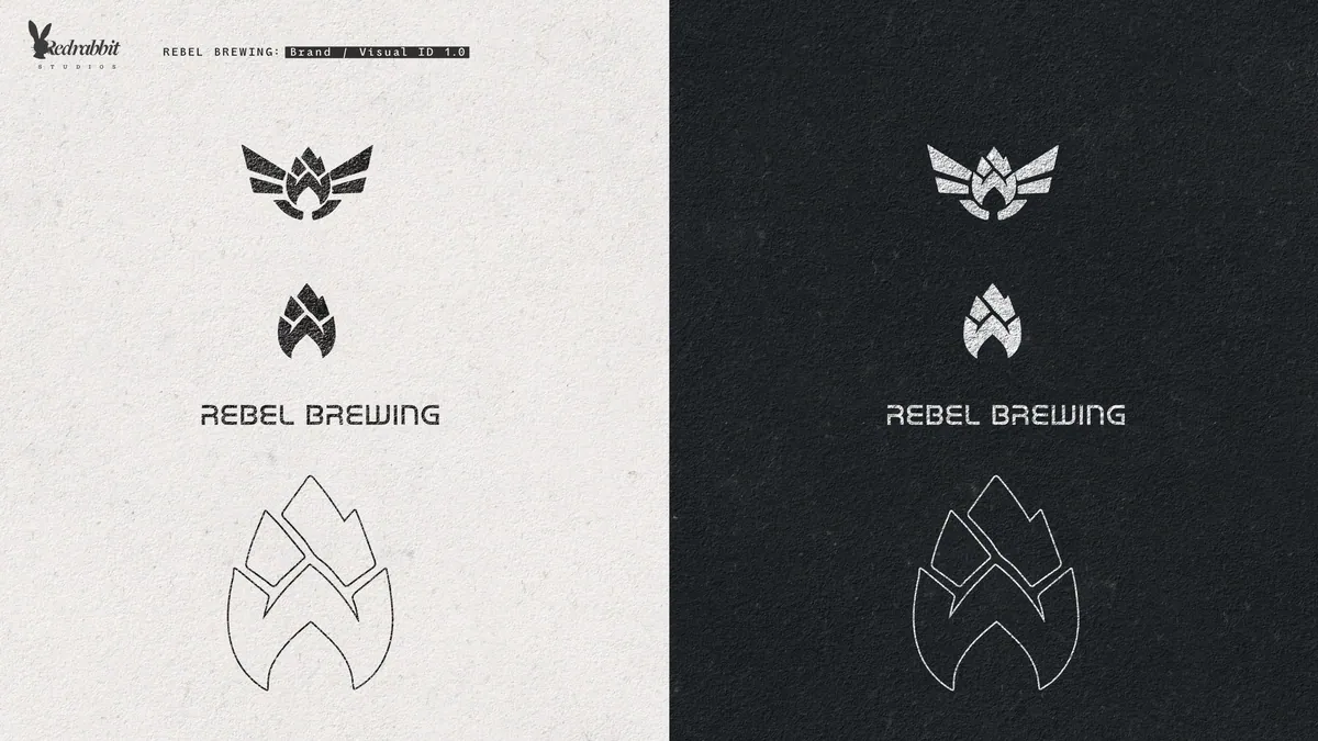
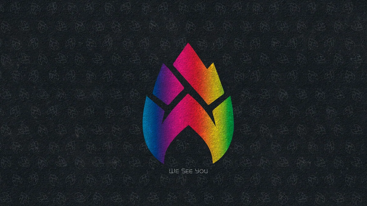
All good logos start with pencil. Each sketch got closer to the heart of Rebel Brewing, until the hop and the wings took flight together: boldness, with a wink to a certain rebel alliance. A construction grid then tightened the mark into something that holds up from a bottle cap to a billboard.
Process
Dressing the Brew
With the mark locked, I explored the look of the flagship can through stylescapes: boards that map a whole visual world, from type and texture to color and attitude. Two directions went head to head. “Monsters” was bright, inclusive and fun. “Rebel Pirate” was darker and punkier. The first won. It matched the brand personality we’d defined: creative over status quo, inclusive over exclusive, fun over expected, unbound over rule-following.


Two worlds. Monsters won.
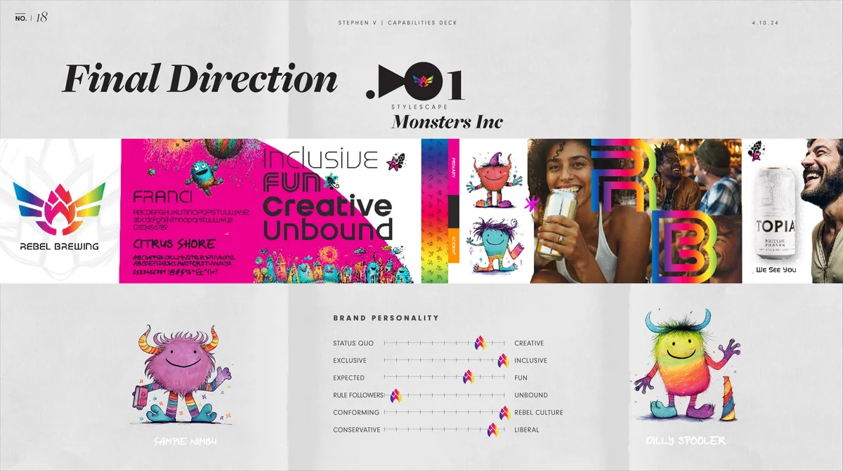
Final direction: the brand personality, dialed in.
The Outcome
Crafting a Can with Character
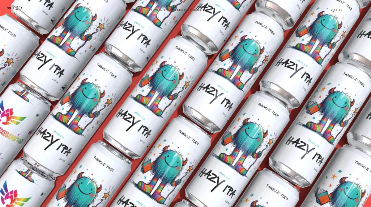
With a clear direction set, I wrapped the beer in packaging as fun and unapologetic as the flavor. The goal was to be accessible, creative and unconventional for craft beer: art you can sip from. Twinkle Toes, a fuzzy teal monster with rainbow socks and a star wand, fronts the can. A whole cast of characters joins him on the carrier, each as individual as the people picking them off the shelf.
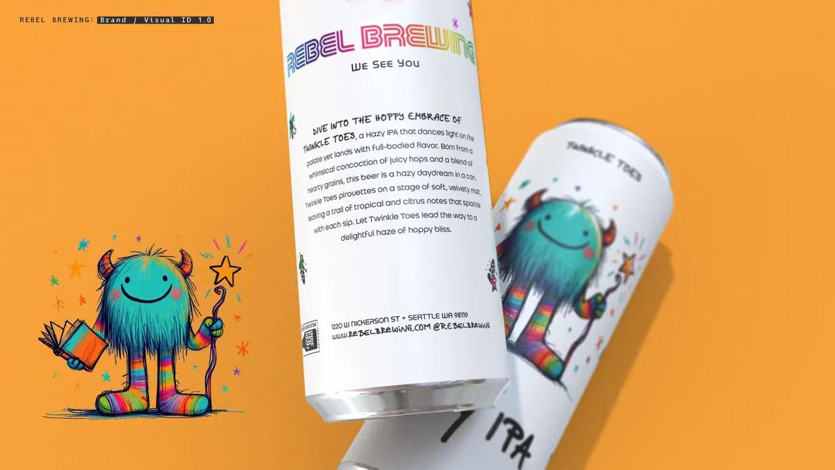
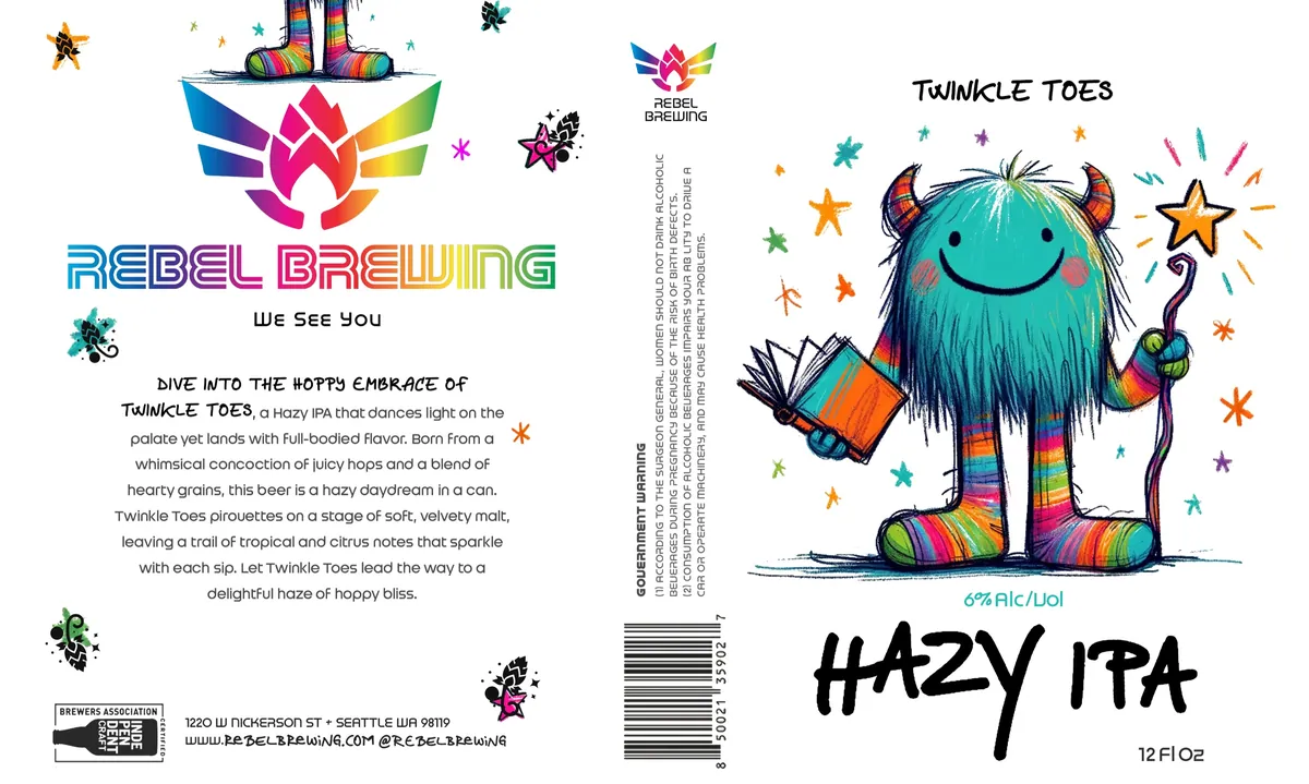
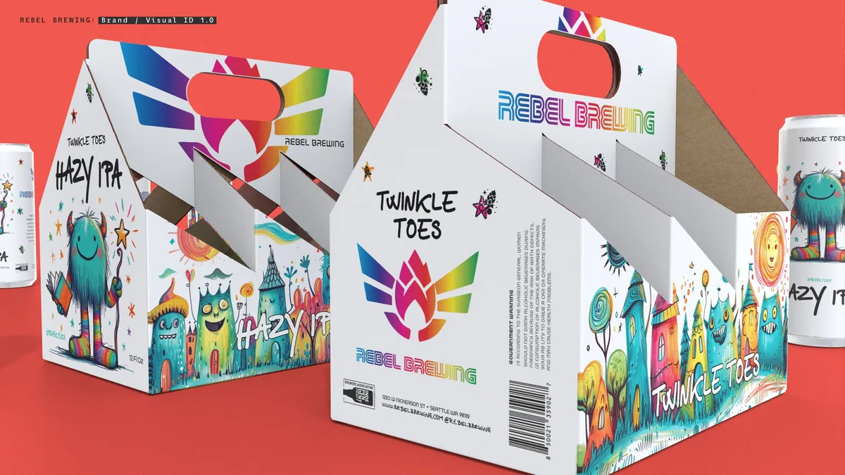
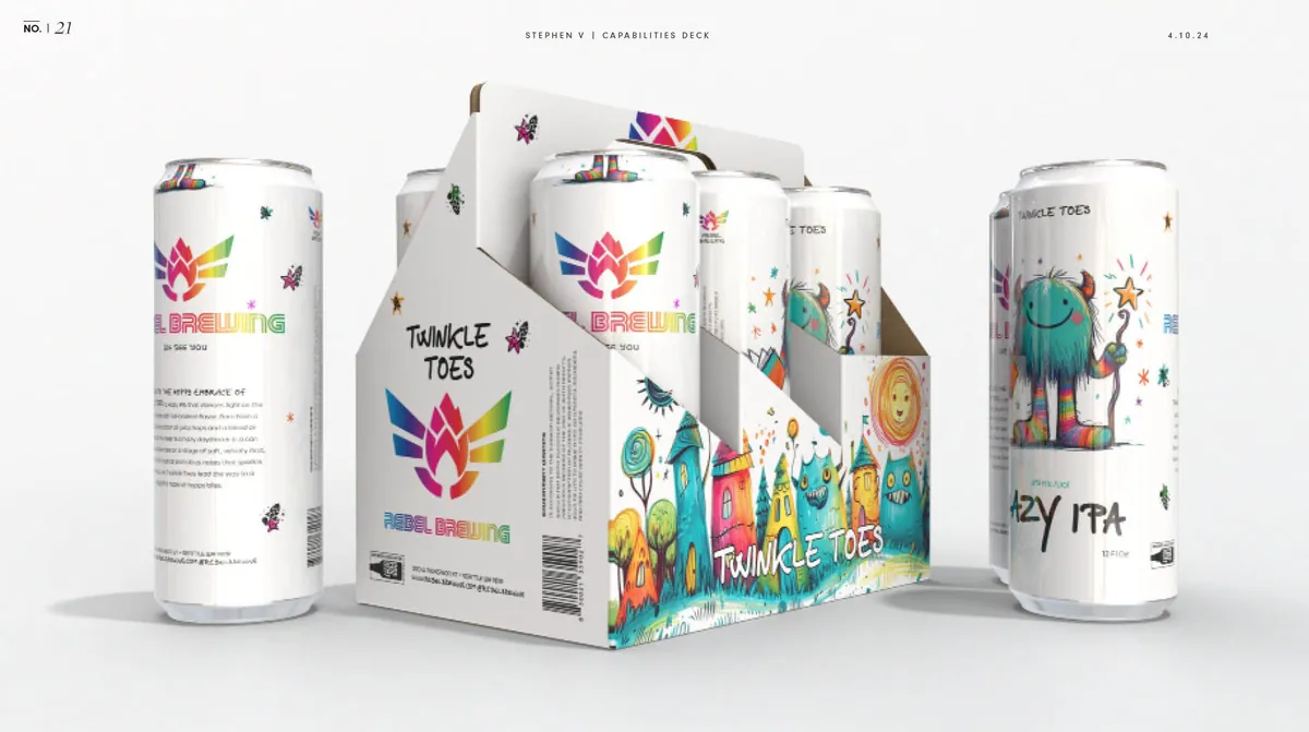
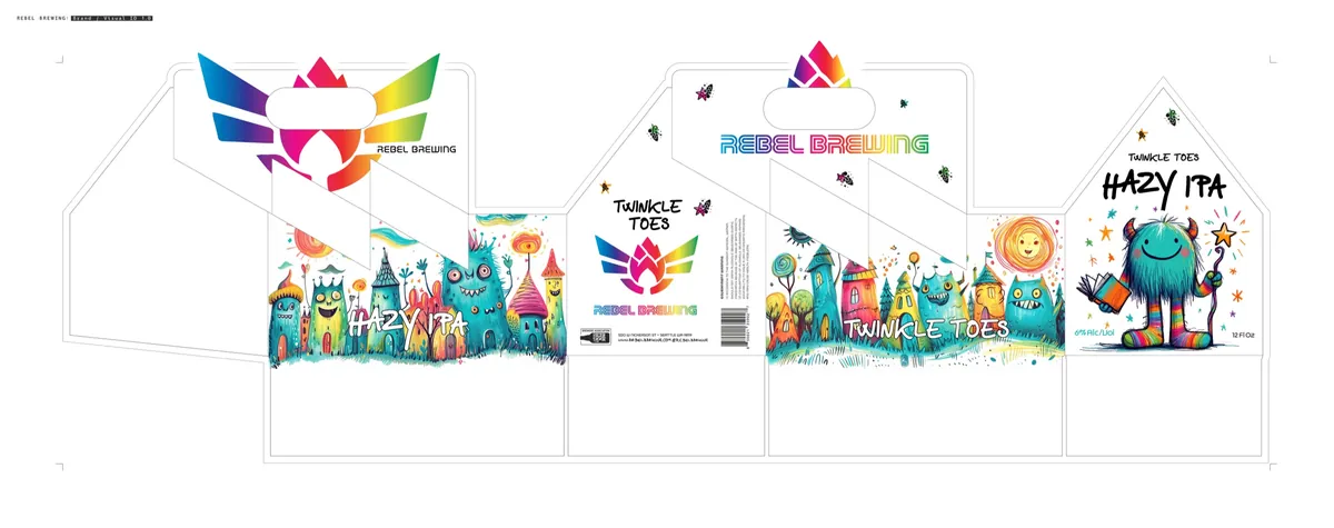
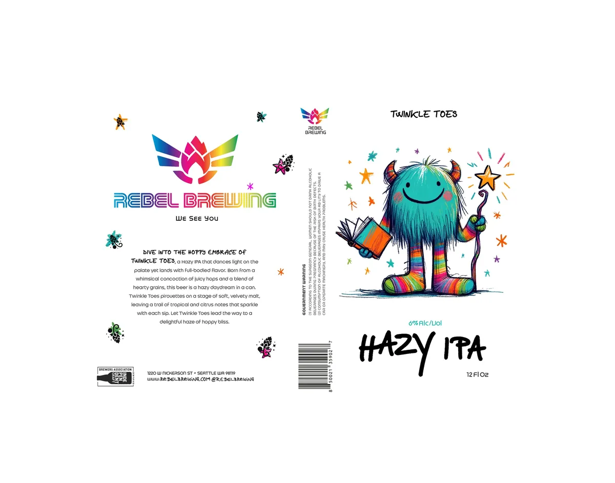
Production: carrier and can dielines.
In the Wild
Meet the Newest Member of the Family
To see the brand where it would actually live, I staged it in lifestyle ads: bars, patios and friends sharing a can, all in the brand’s warm, welcoming voice.
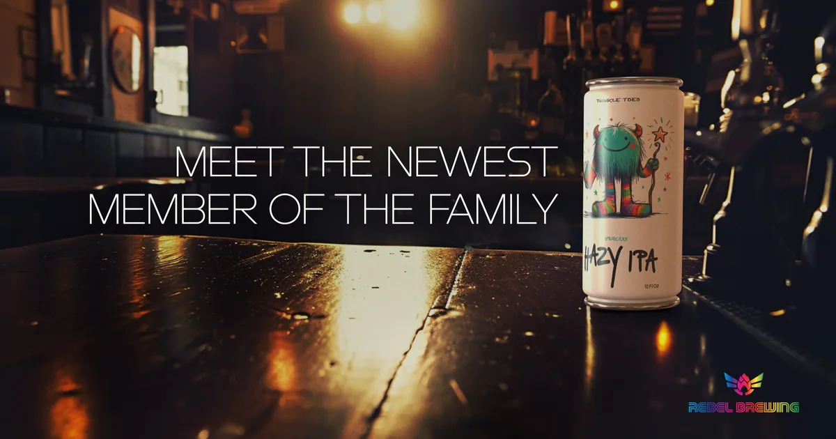
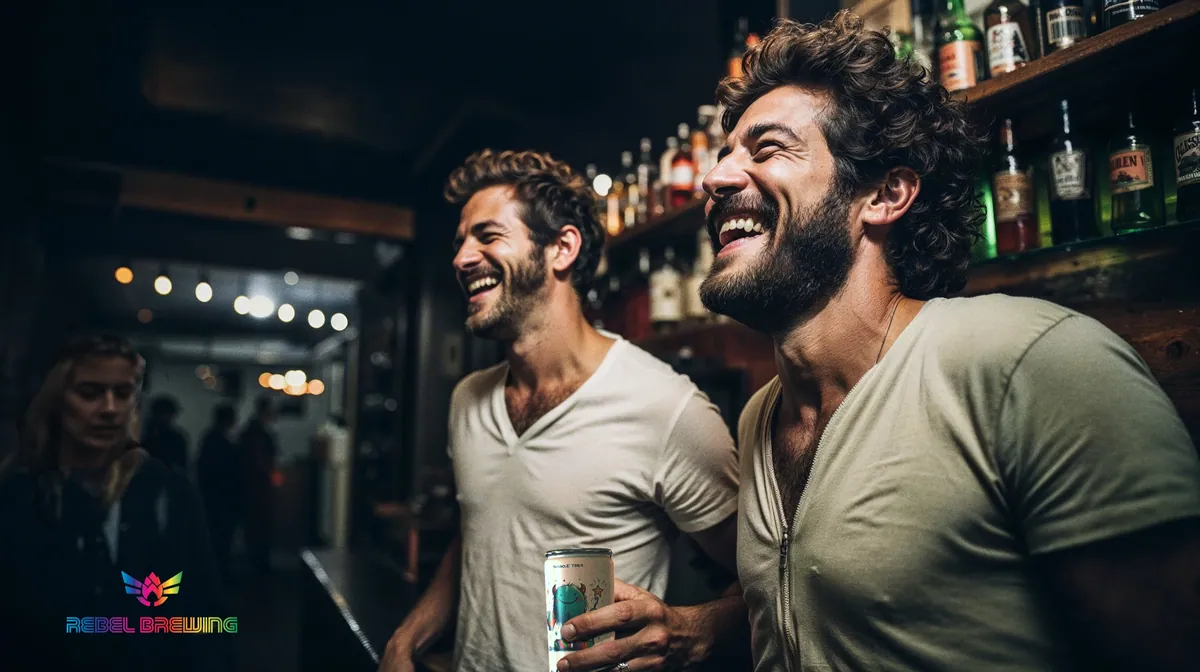
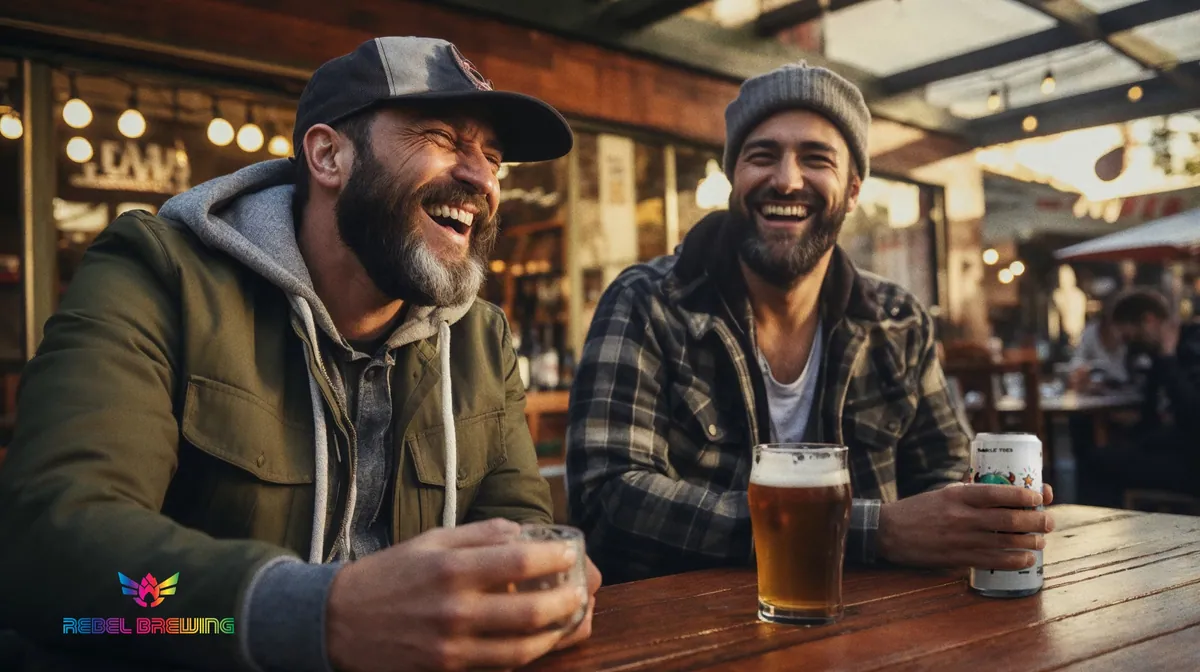
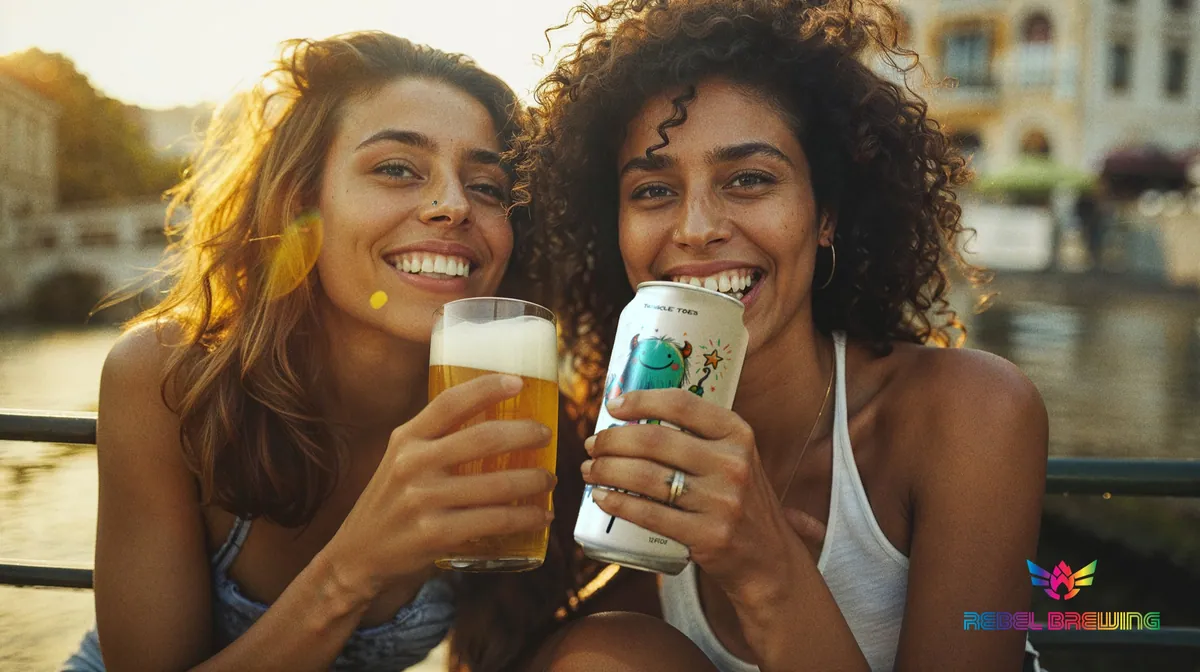
Lifestyle ad concepts.