WorkRye Barcott
Two Letters That Wouldn’t Leave
Courage Can Save Us · Rye Barcott · Bloomsbury
One cover that didn’t survive the sales meeting, ten more in a weekend, and the two letters that made it to the shelf.
- Mission
- Give Rye Barcott’s book about ten extraordinary Americans a cover with the weight of its subject: one the author, the publisher’s sales team and a bookstore shelf could all say yes to.
- Outcome
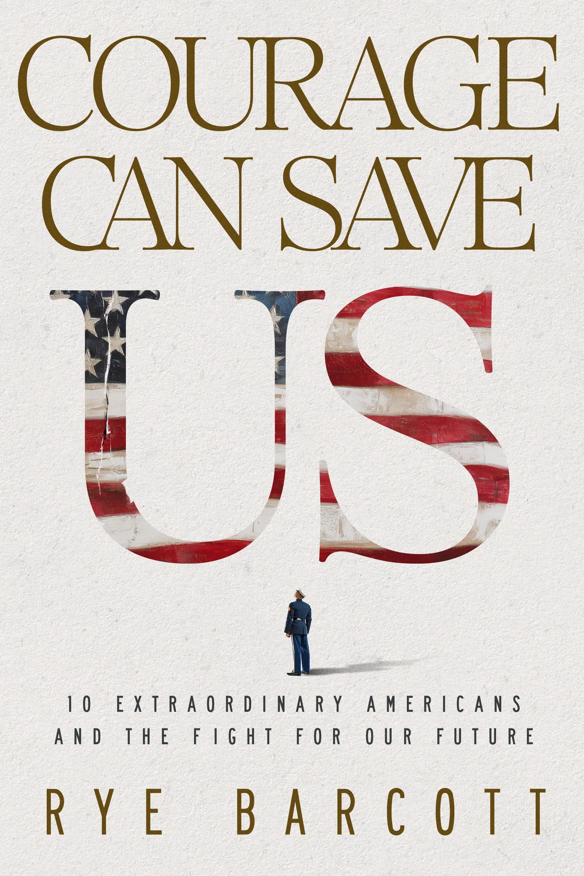
- A US the size of a monument, filled with a weathered flag, with a hairline crack in the U and one small Marine in dress blues looking up at it. The concept went to the shelf on the Bloomsbury jacket.
- Impact
- The author called it “SUPERB work”, the publisher said yes, and the book went on to become a New York Times bestseller.
Services
Credits
- Concept and cover design: Stephen V. Final jacket typography: the publisher’s studio.
The brief
A Roman Emperor Walks Into a Sales Meeting
Rye arrived with a clear idea: one face, split in two. Half Marcus Aurelius, half modern Marine. I built it properly, laurel crown and all, and he loved it.
Then it went to the publisher, and the publisher’s team passed. To a reader who hasn’t opened the book yet, they felt, it looked like Roman military history. In my experience that kind of no is final, and I told Rye so. I’d rather be honest than hopeful.
One thing on that cover was worth keeping, though. Two letters: the US at the end of the title, filled with a flag.
Your work was superb.
The call
A Note After Midnight
A few weeks later, over the holidays, Rye wrote again. Dozens of covers from a celebrated New York studio were on the table, and he was still looking for the one that felt like his book. Could I help with some fresh thinking?
He sent the manuscript. I meant to skim the first chapter and couldn’t stop. His notes were short: courage is the operative word. Type that is bold, stately, serious. The flag, but not too much of it.
So I did something I’d normally never do.
Round one
Ten Covers in a Weekend
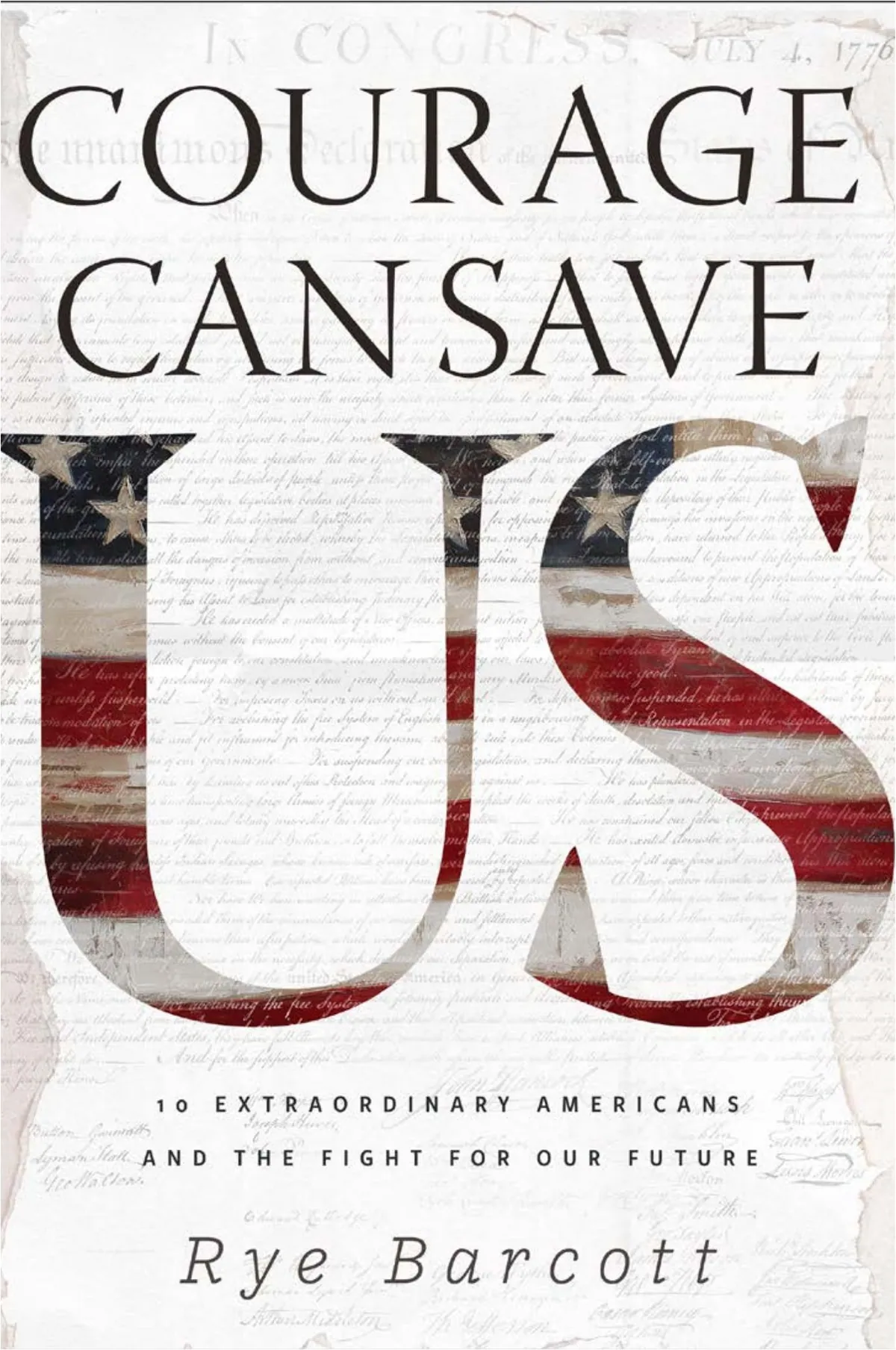
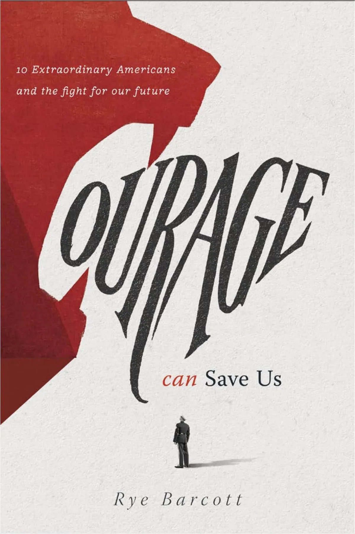
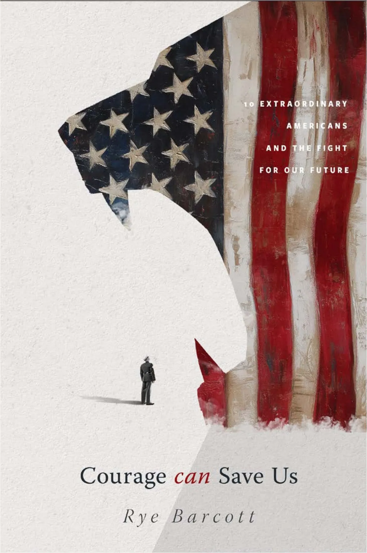
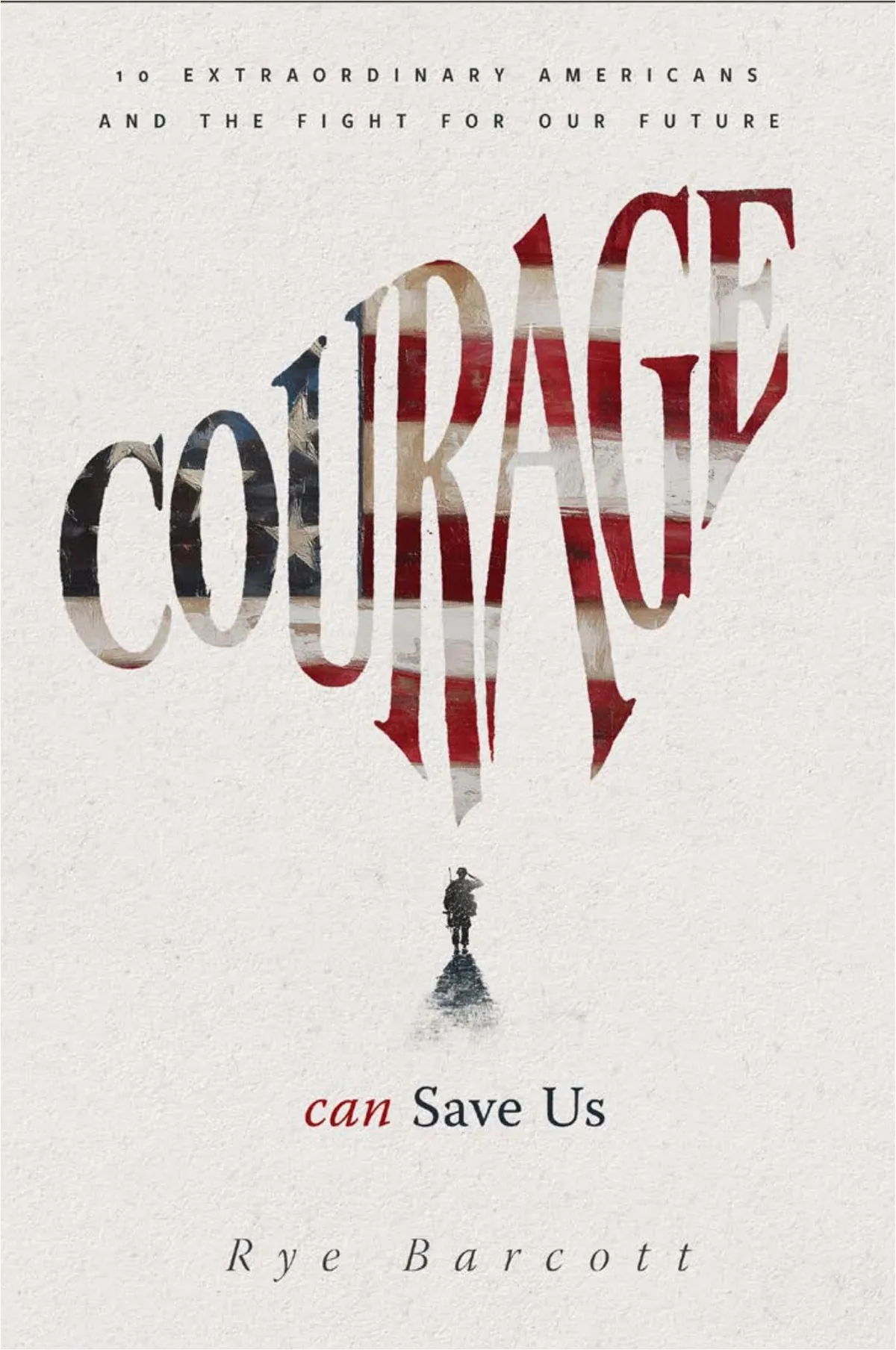
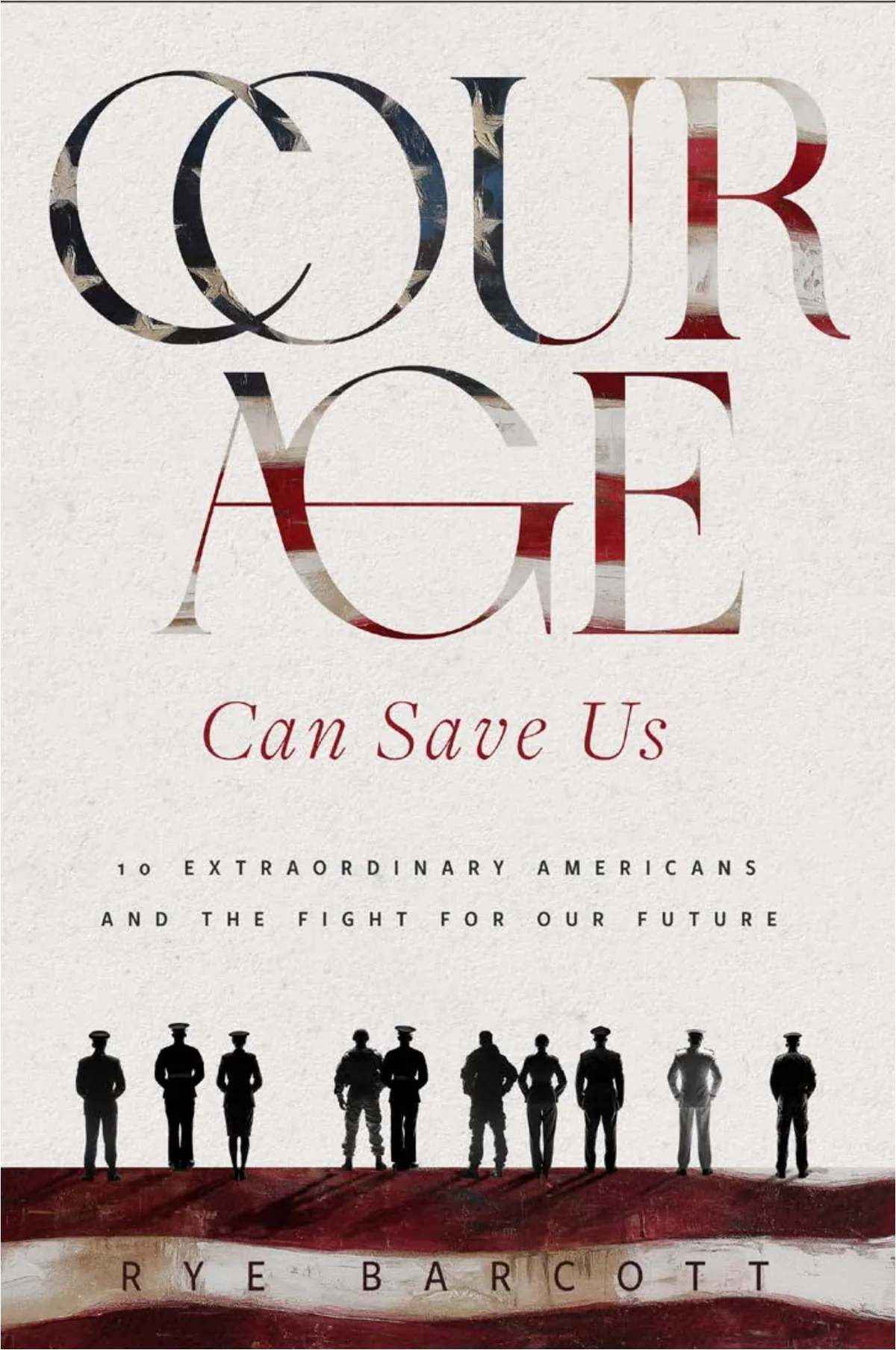
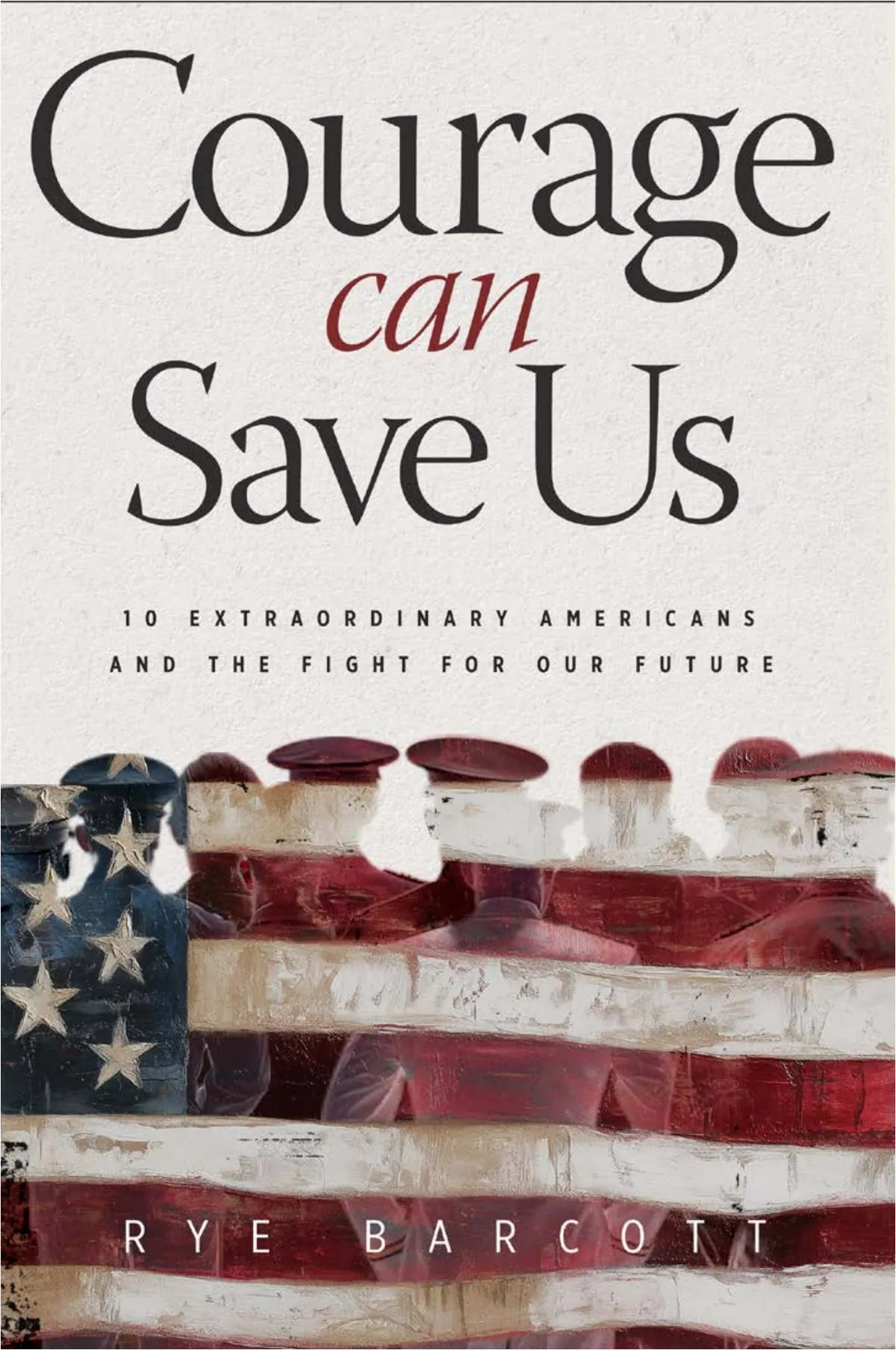
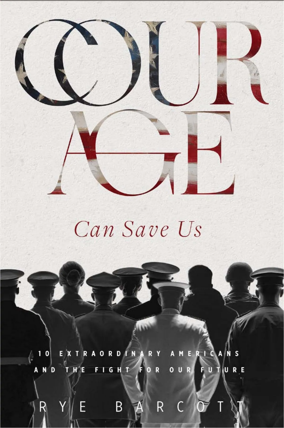
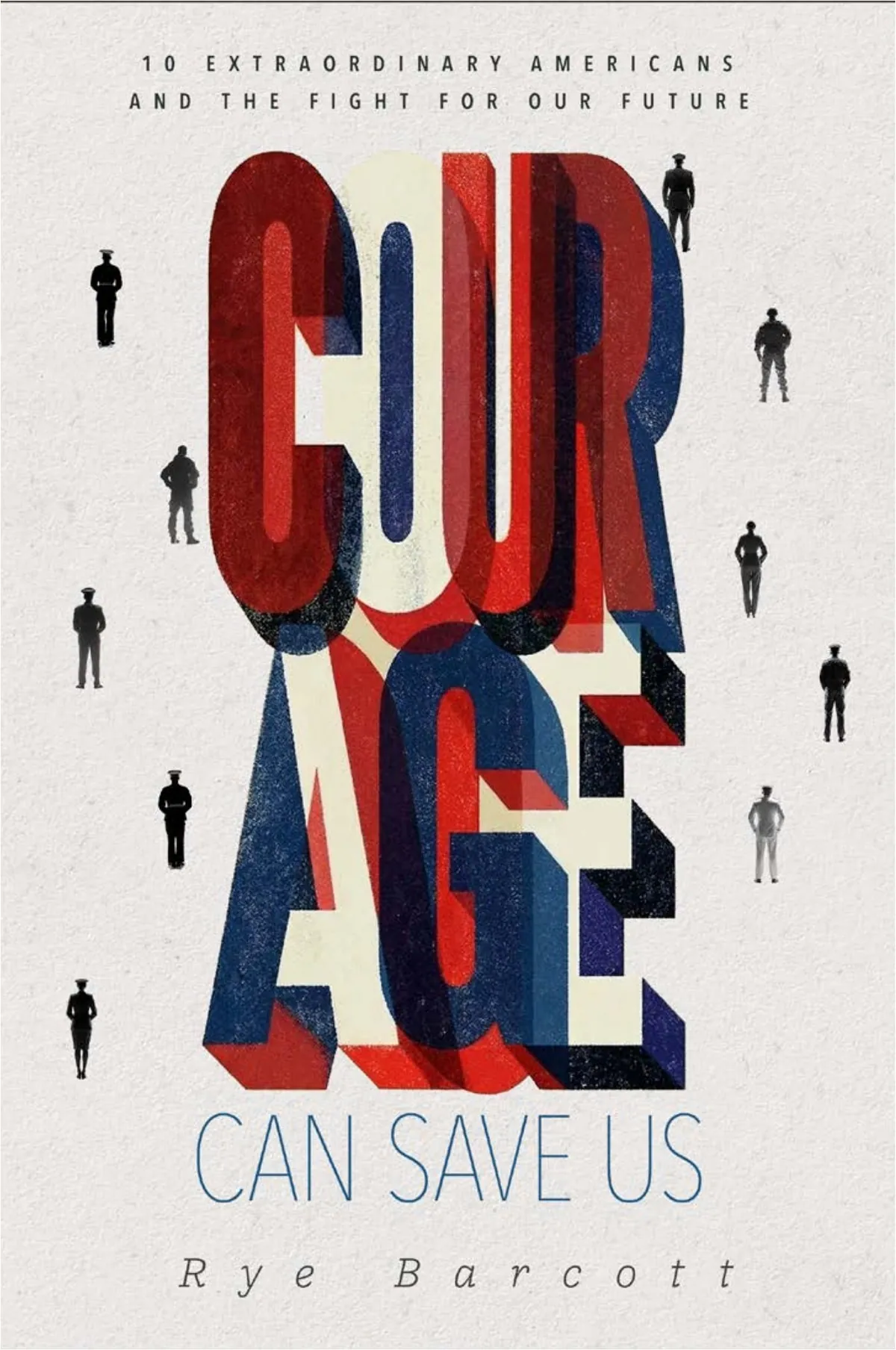
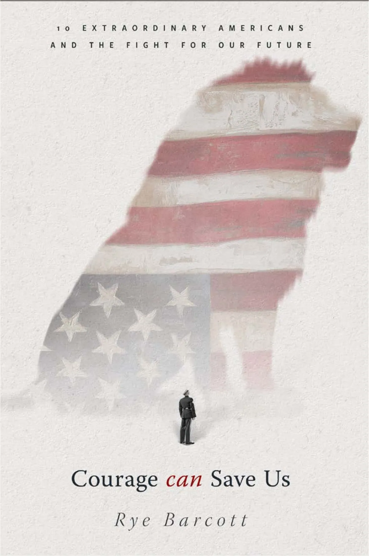
Nine of the ten; the tenth gets a page of its own. I loved the lion more than was sensible. Lions rarely make it.
Why so many
I’d never usually show ten. Three, maybe five. But we were well into uncharted territory, and the book deserved every idea I had, even the ones that might only be a springboard for someone else.
Rye read them that night. He passed on anything that broke COURAGE across two lines, called number ten beautiful, and kept coming back to number one.
Really like the concept with 1. I think this may be the way to go for the publisher from a commercial standpoint. It’ll pop on the shelf and clearly tells what the book is about.
The spark
The Quiet One
One of the ten was almost nothing. A tiny figure on an outcrop, a small title, and a lot of empty paper. I couldn’t leave it alone. It had something the louder ones didn’t: reverence.
And it handed me the bigger idea. If one small figure in a wide, quiet field can make you feel the weight of something, then scale is the message. So what if he wasn’t looking out at nothing? What if he was looking up at something enormous?
Number one already had the letters. Number ten had the feeling. The cover was the two of them together.
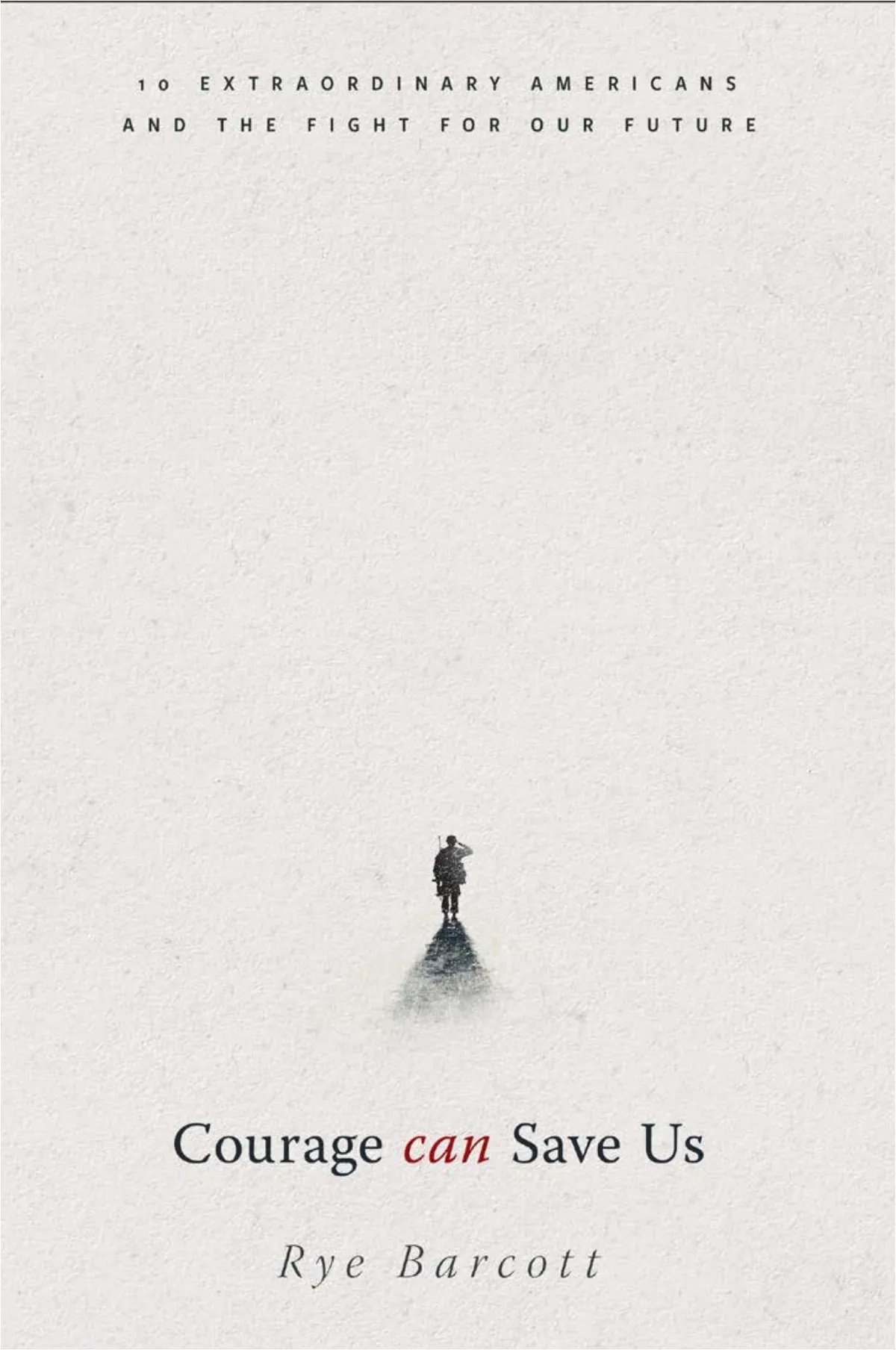
Number ten. Not the cover, but the reason for it.
The idea
A Crack in the U
Number one put the flag inside the US and laid it over the parchment of a founding document. It said what the book was about from across a room.
Then Rye asked the question that made the cover: could it also carry the challenge in front of the country? Something like a crack in the armor: one that can be repaired, but isn’t a foregone conclusion.
So the U got a hairline crack. The parchment went, the title turned to bronze, and one young Marine in dress blues arrived underneath, small, looking up. Courage turns out to be a question of scale.
The object
Under the Jacket
A cover is also a thing you hold. So I pitched Rye one more idea: a short jacket, just a band carrying the title, over a case printed with the oath of office set as large as it would go. I do solemnly swear.
It never went to print. I’d still like to make this one someday.
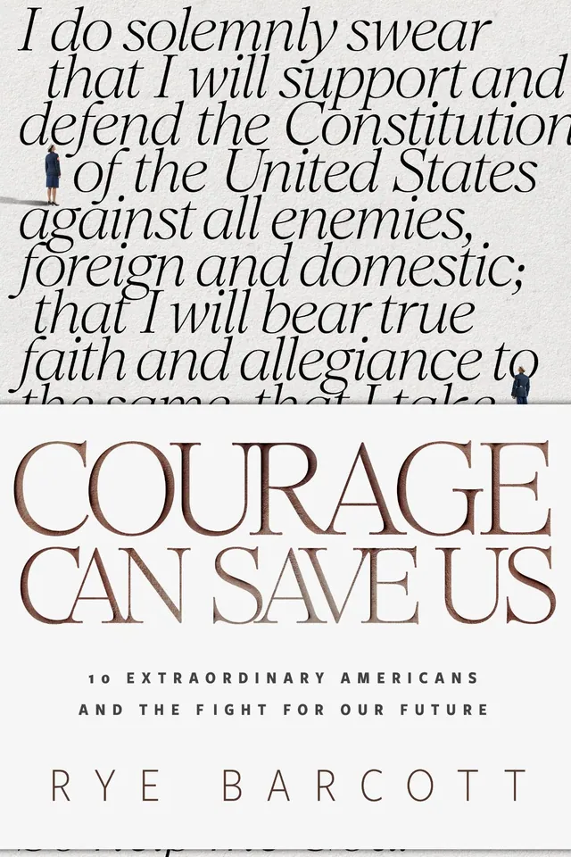
An idea I pitched to Rye that never went to print: the oath on the case, the title on a half jacket.
The outcome
To the Shelf
The publisher said yes. I handed over the layered files, and the publisher’s studio carried the concept to press: the flag-filled US, the crack, the small Marine.
The book went on to become a New York Times bestseller. Two letters made it all the way from the first cover to the last.
Thanks again Stephen for the SUPERB work. I love where this landed too.
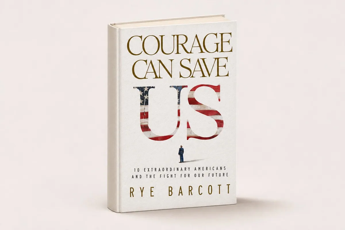
The cover as I designed it. The concept went to the shelf on the published jacket.