WorkDenver Museum of Nature & Science
A Smile You Can’t Unsee
Jurassic Oceans: Monsters of the Deep
Marketing a megalodon moment, and how we brought Jurassic Oceans to life in Denver.
- Mission
- To get Denver’s families excited about sea monsters most of them had never heard of, in Jurassic Oceans: Monsters of the Deep, on loan from London’s Natural History Museum. And to capture the awe and scale of the show without using a single dinosaur.
- Outcome
- A punchy, multi-channel campaign full of big headlines and bigger visuals. It ran across Denver on billboards, bus and light-rail wraps, convention-center screens, elevator graphics, guerrilla signage and social.
- Impact
- The campaign sparked early buzz, earned praise from the Museum’s teams and the London lender, and gave everyone one shared way to talk about the show.
Services
With
- Hilary Wheeler: headline and concept copywriting, strategy, creative direction
Credits
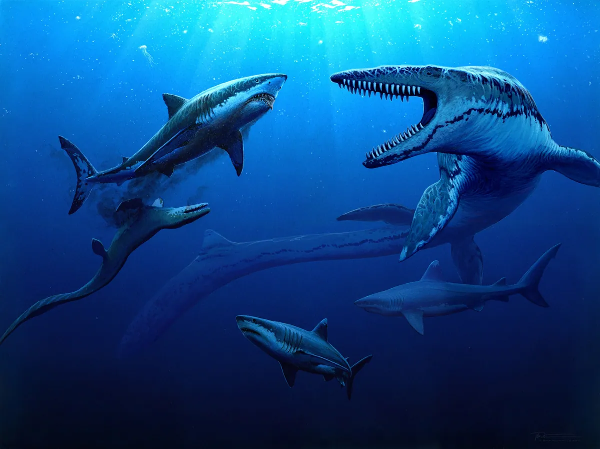
- Illustration: Bob Nicholls
Exposition
Welcome to Denver’s Deep End
The Denver Museum of Nature & Science is one of the region’s most loved institutions, known for making science accessible and awe-inspiring. Its audiences are mostly families and educators: people who care about discovery and hands-on learning.
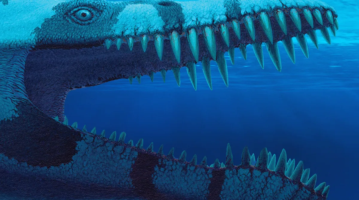
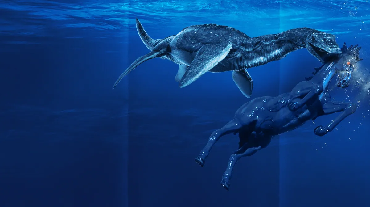
DMNS was preparing to host Jurassic Oceans: Monsters of the Deep, on loan from London’s Natural History Museum. It promised a plunge into the prehistoric seas, where massive marine reptiles once ruled. These weren’t the dinosaurs everyone already knew. These were mosasaurs, ichthyosaurs, and sharks with teeth as long as your forearm.
The Call
Make a Splash
DMNS needed a campaign that could grab attention across the city, speak straight to families, and show just how different this exhibition was. With more than 150,000 visitors expected, this wasn’t just another rollout. It was a major event on the Museum’s calendar, with ticket goals and a whole communications team to line up behind it, from education and exhibits to marketing.
We were asked for three fully developed campaign concepts, each rooted in strategy and storytelling, and to move fast. The excitement was immediate, and so was the responsibility.
The Process
Wrangling Sea Monsters and Approvals
We started by diving into the subject, from scientific briefings to walkthroughs of the show. We wanted to understand not just what the exhibition showed but how it made people feel: wonder, curiosity, maybe even a little fear. Those feelings steered the creative.
From there we built three distinct directions, each with its own tone, look and messaging, ranging from playful and hands-on to bold and cinematic. Once the Museum chose one, we moved into production: out-of-home, transit, event signage and more. Because the exhibition was on loan, every piece also had to pass a final review by the lender in London.
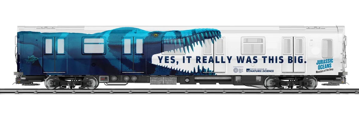
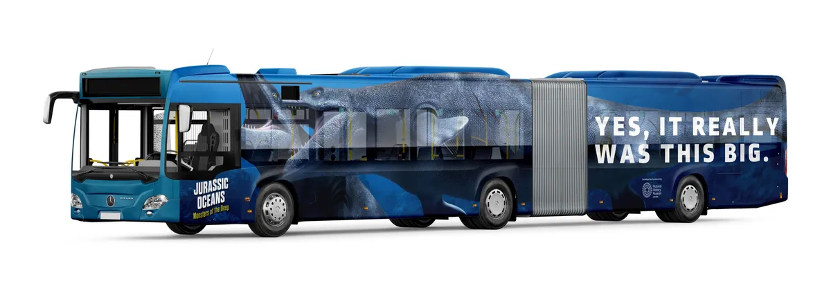
Light rail and bus wraps.
The Lines
Big Headlines, Bigger Visuals
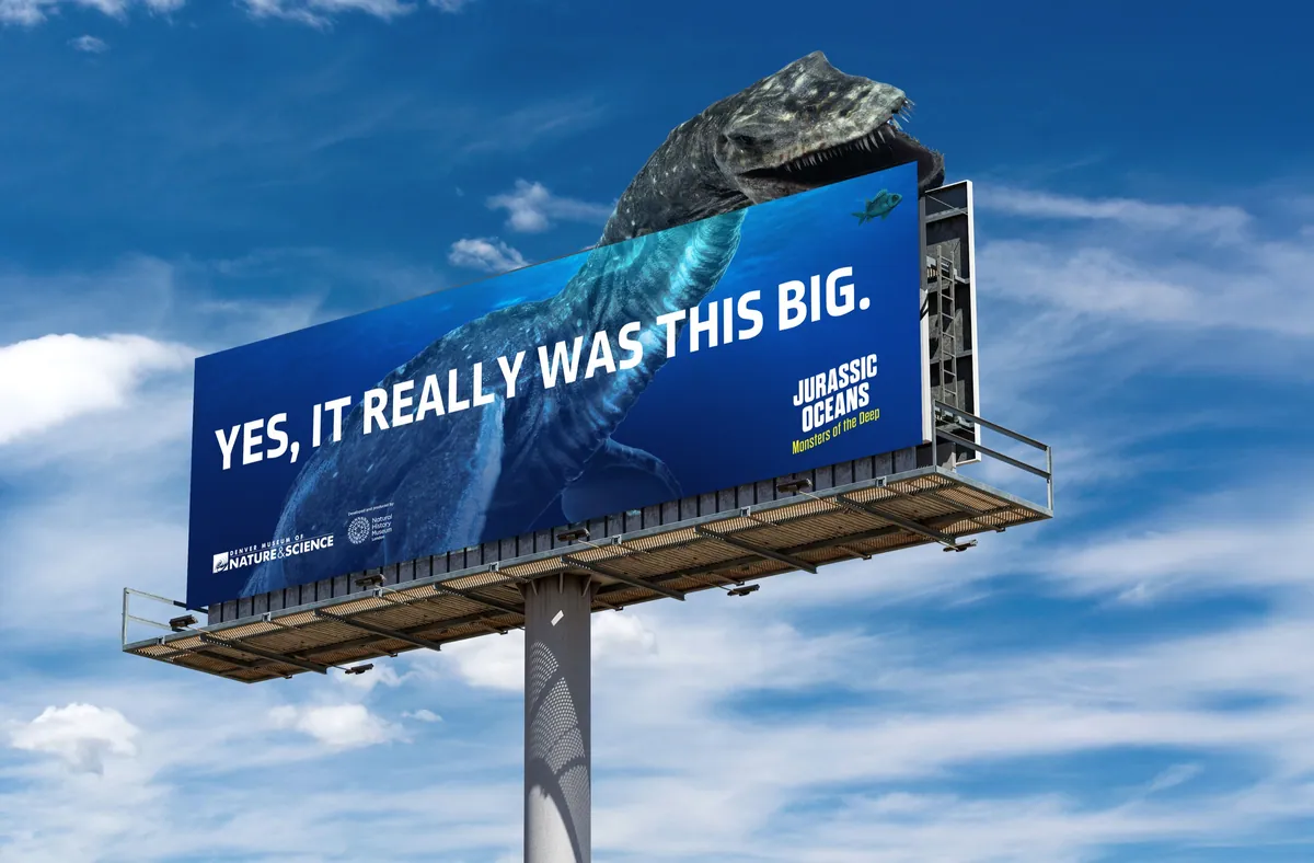
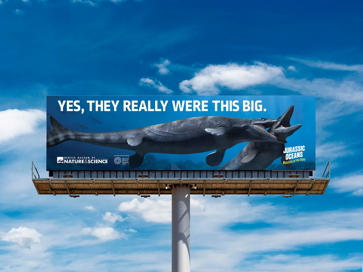
- Yes, it really was this big.
- Enter at your own risk.
- Mind your step.
- Splash zone.
- Please don’t feed the megalodon.
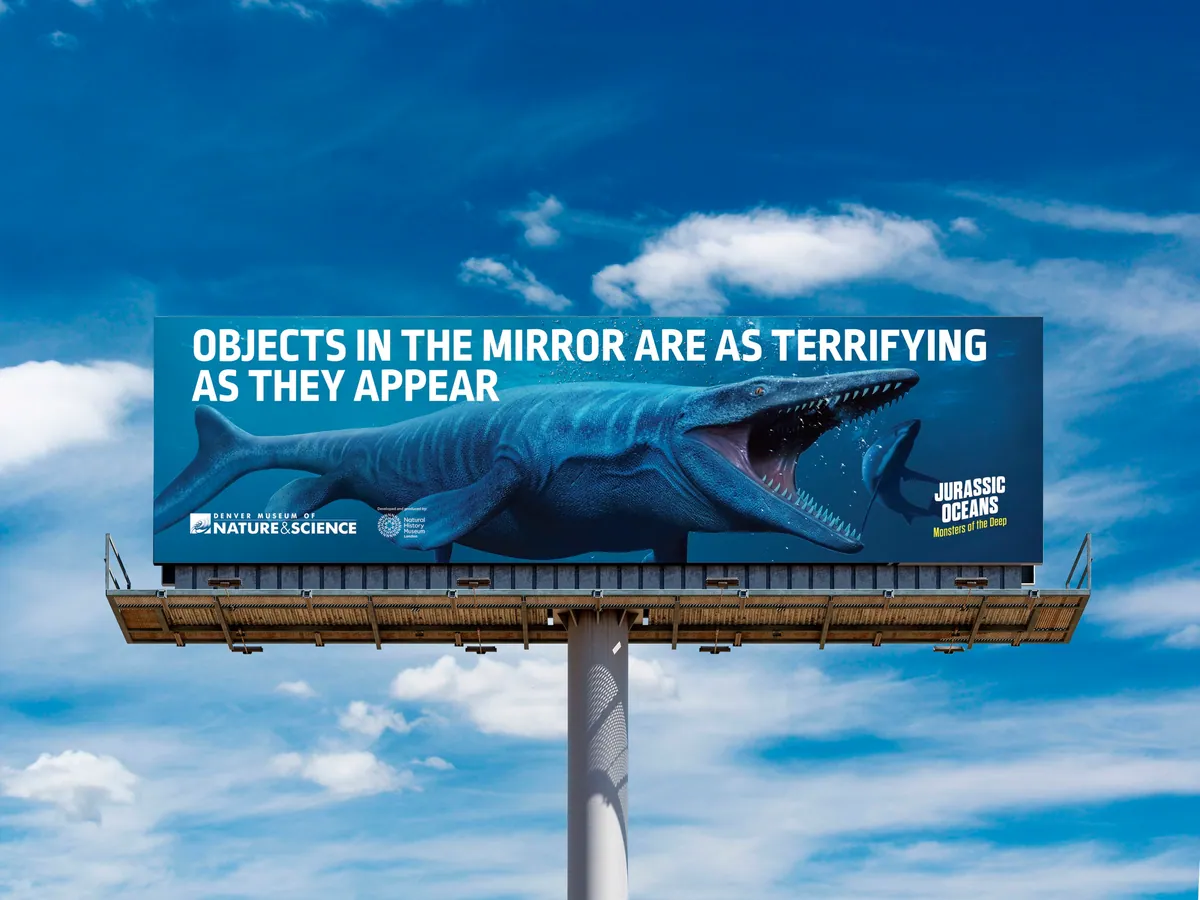
- Objects in the mirror are as terrifying as they appear.
- A megalodon had about 276 teeth. Imagine the size of that toothbrush.
- And you thought summer sales were big.
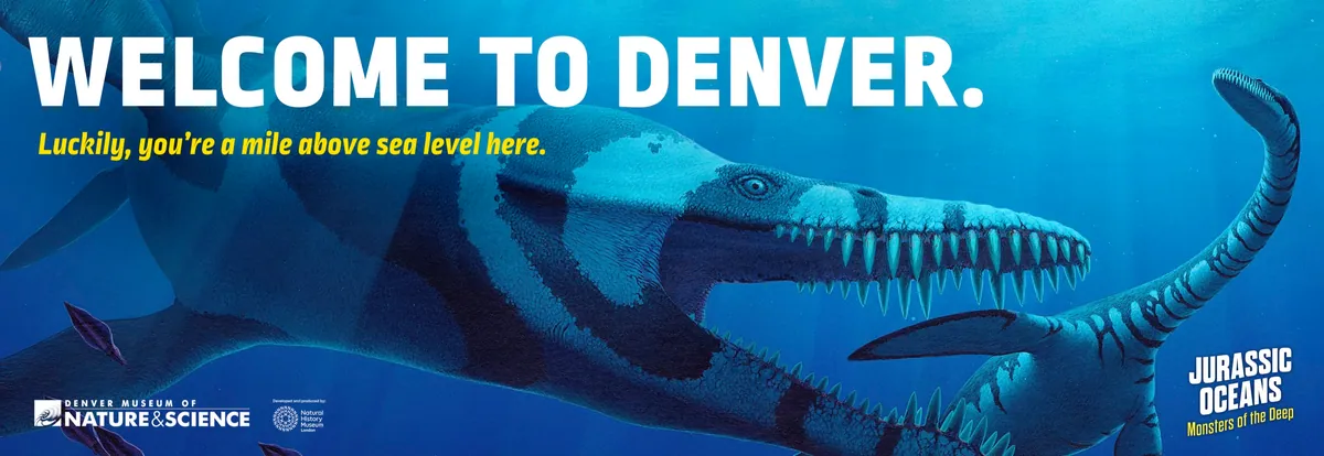
- Welcome to Denver. Luckily, you’re a mile above sea level here.
- 165 million years ago you would have been on the endangered list.
Headline copywriting with Hilary Wheeler.
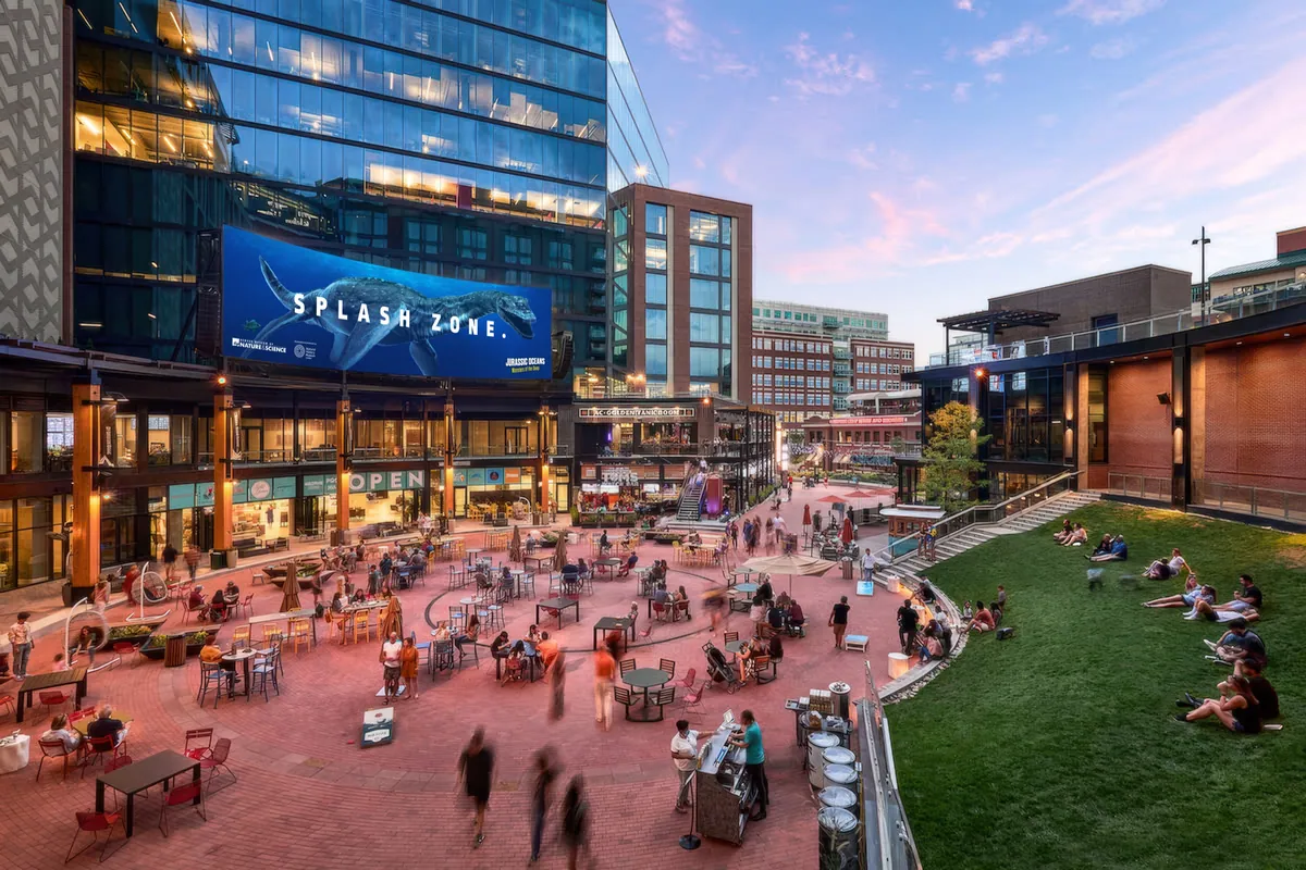
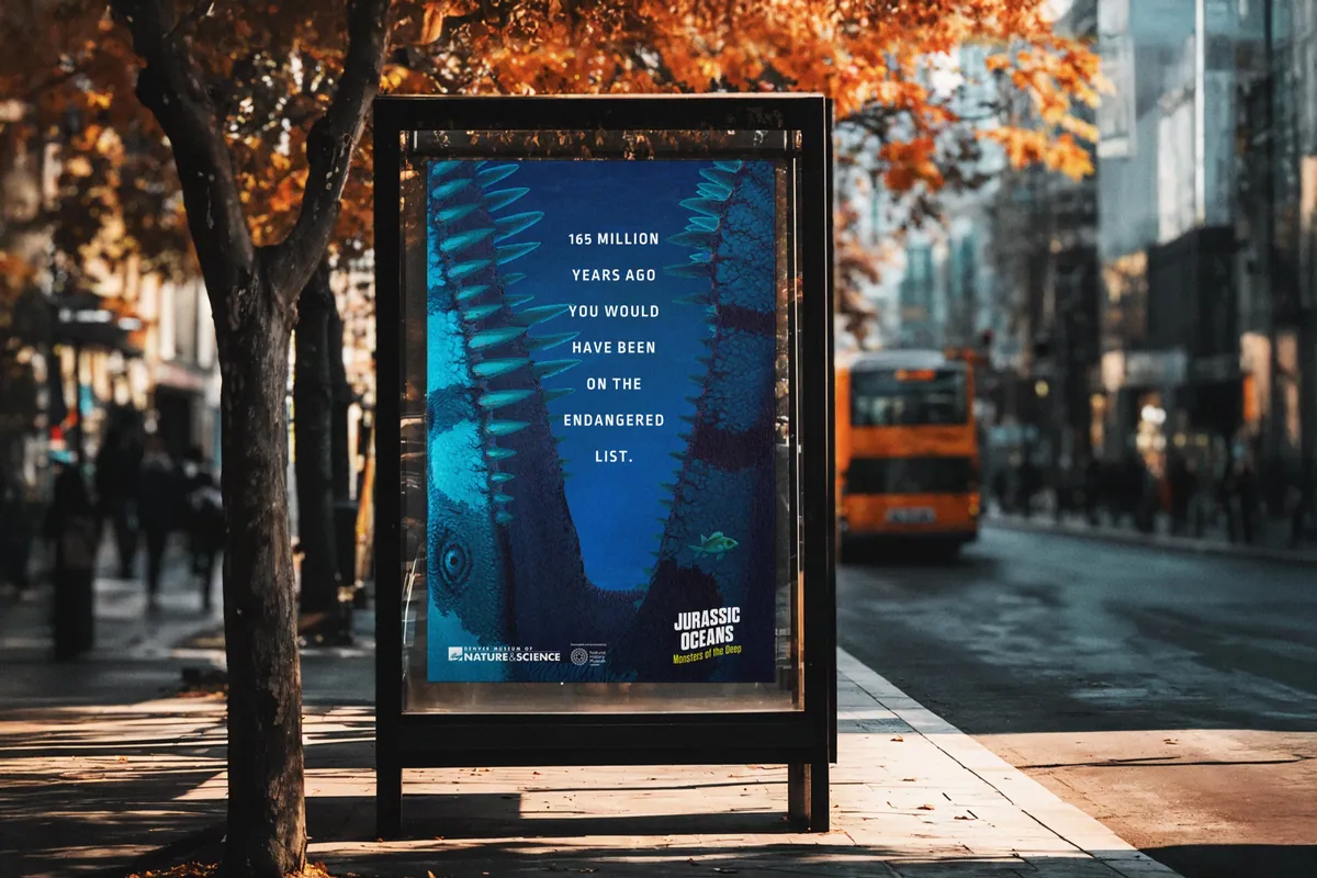
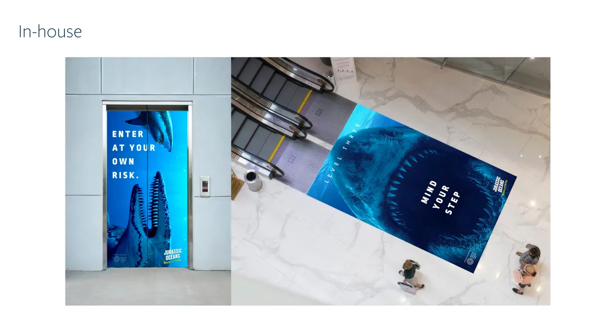
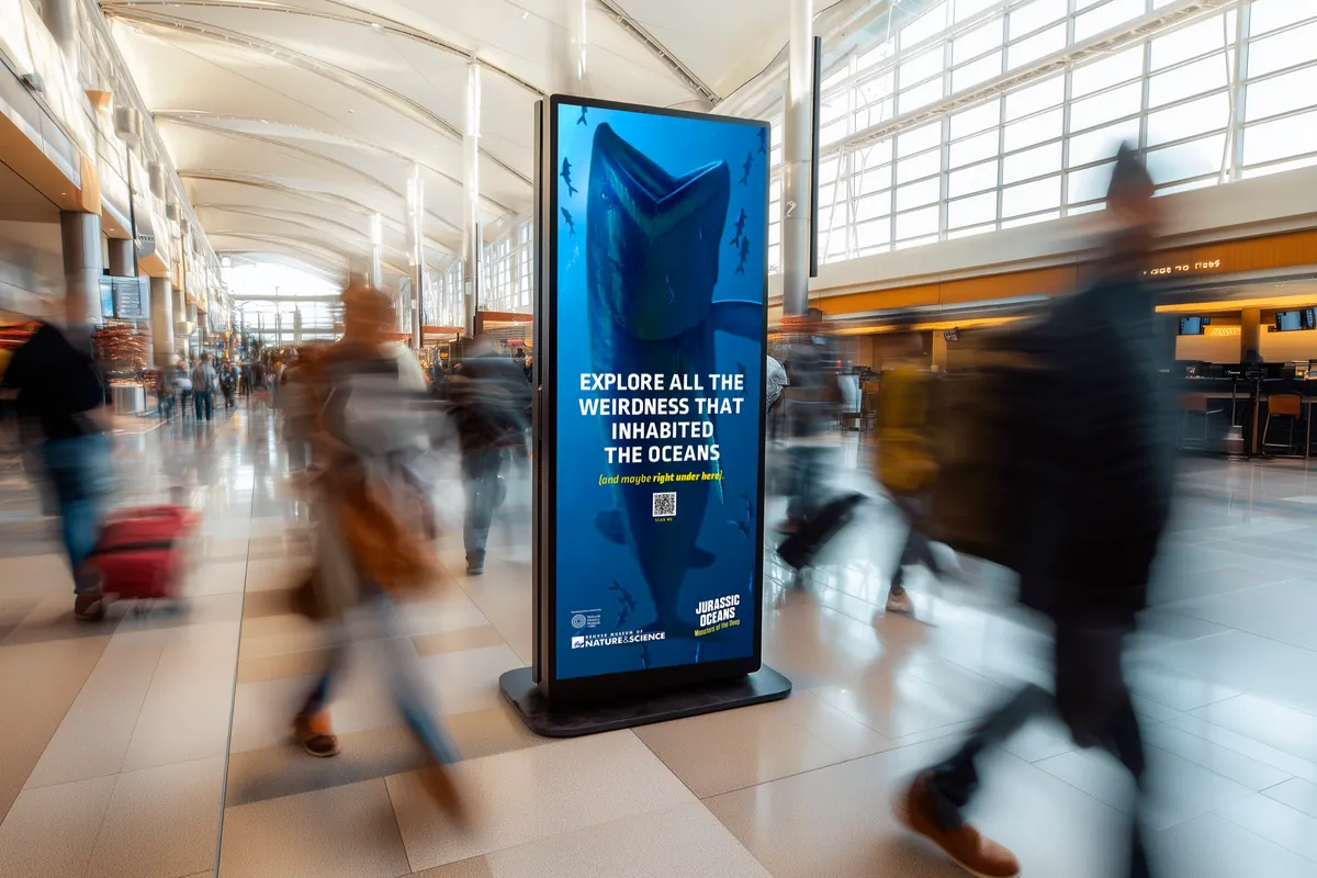
Out of home, in-house and environmental.
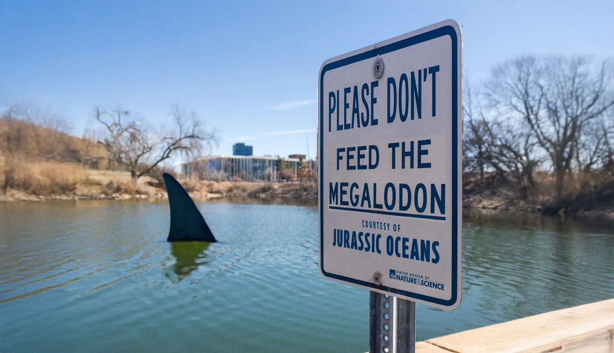
Guerrilla: a megalodon in the local lake.
The Outcome
Outcome
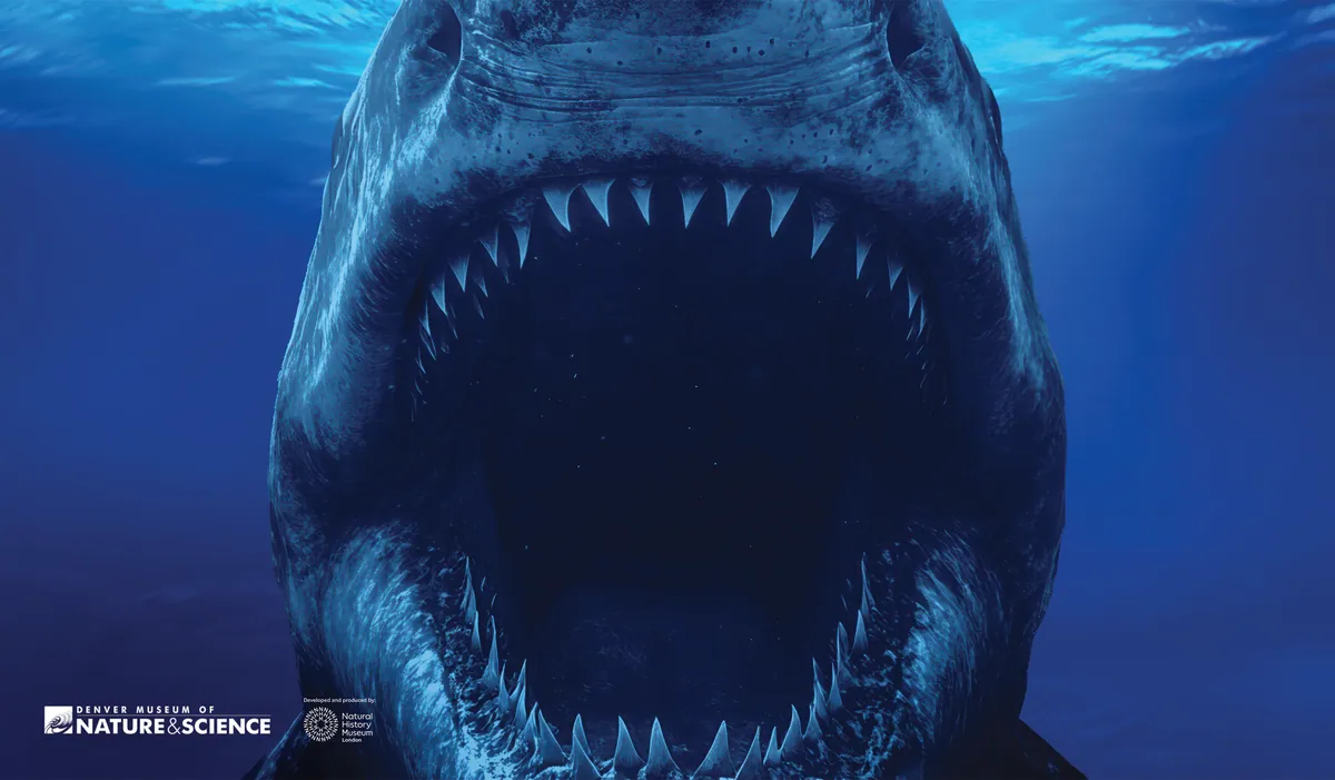
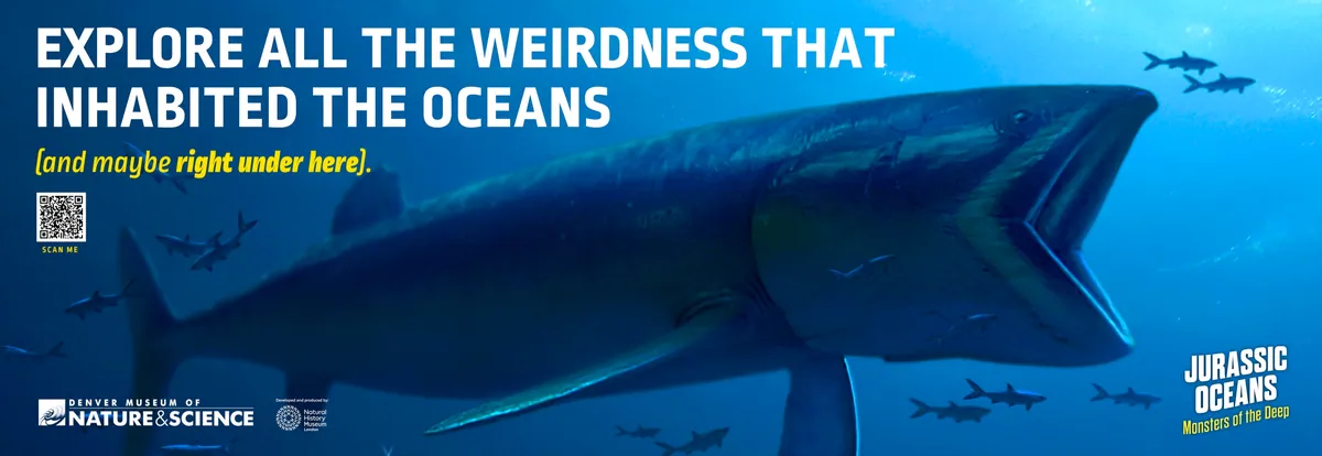
The final campaign paired big, bold visuals with playful, attention-grabbing headlines. The look was scientifically respectful and undeniably fun. It showed up all over Denver: billboards along highways, wraps on city buses and trains, screens at the convention center, even elevator graphics that warned visitors to “Enter at your own risk.”
The tone made it work: smart and approachable. It invited families in with humor, then rewarded them with depth. The design stayed clean and dramatic, using scale and a tight palette to land from a distance. Every asset went over as a high-resolution, print-ready file tailored to its placement, built to carry the exhibition’s story out into the street.
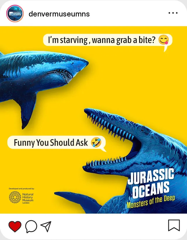
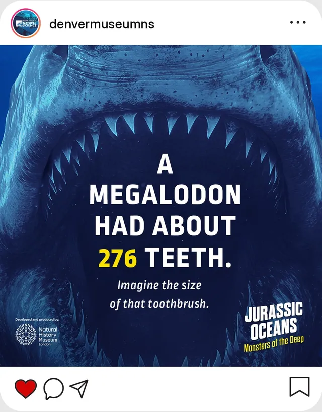
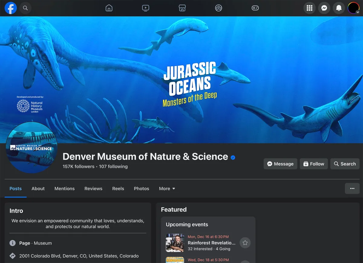
Social.

The Impact
Impact
The campaign helped DMNS launch Jurassic Oceans with clarity, confidence and wide visibility. It created a citywide moment of intrigue, turning heads on buses, sidewalks and elevators with one consistent voice that felt fresh and right at home. Marketing loved how cohesive and easy to roll out the assets were. The exhibits and education teams felt the tone captured the spirit of the show.
Even before opening day the campaign was generating buzz and early ticket sales. More importantly, it became a shared language across departments and even with the exhibition’s international stakeholders. It helped shape how the exhibition was talked about, shared and experienced. For us that’s the true sign of success: design that moves people to step inside and explore something extraordinary.