WorkDenver Museum of Nature & Science
Echoes of an Empire
Angkor: The Lost Empire of Cambodia
How we gave a lost civilization a voice on Denver’s streets.
- Mission
- To introduce Denver’s families to an empire most had never met, Angkor: The Lost Empire of Cambodia, the Museum’s first exhibition focused on Southeast Asia, with the respect a sacred site deserves.
- Outcome
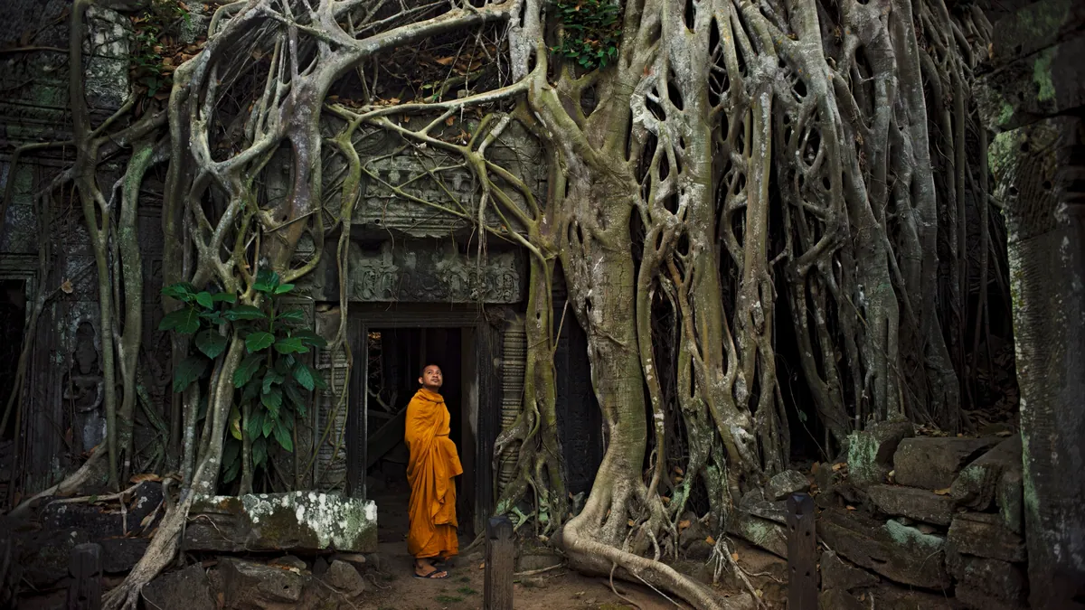
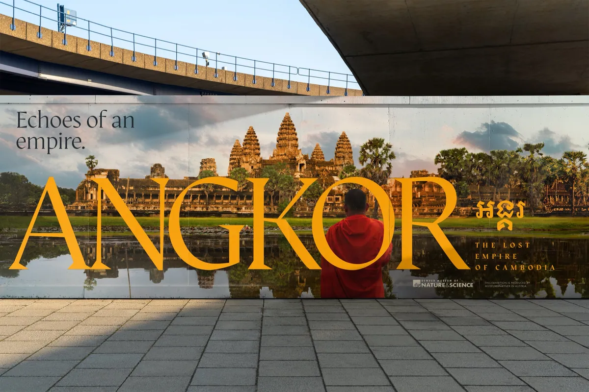
- A photography-led campaign anchored by a bold ANGKOR wordmark, built to flex from a 36-foot entrance banner and elevator wraps to street banners, billboards, posters and social.
- Impact
- The campaign became the exhibition’s identity. The Museum adopted our wordmark for the show itself, the in-house team got print-ready files a week early, and DMNS asked us back.
Services
With
- Hilary Wheeler, Little Man Group: headline and concept copywriting, strategy, client lead
Credits
- Monk & vines still: K2 Studios (Angkor IMAX film)
- Artifact photography courtesy of MuseumsPartner
Exposition
Welcome to the Jungle
The Denver Museum of Nature & Science was preparing to open Angkor: The Lost Empire of Cambodia, an exhibition produced by MuseumsPartner in Austria. It brought more than 120 original objects to Denver, many on tour for the first time. Together they told the story of the Khmer Empire, the civilization that built Angkor Wat and ruled much of Southeast Asia for centuries before the jungle swallowed its great city.
For the Museum it was new territory. DMNS had never hosted an exhibition this focused on Southeast Asia. Its core audience is families who love to travel and introduce their kids to other cultures, and they knew Angkor Wat as a postcard, if at all. Very few knew the empire behind it.
The Call
Wonder, Not Gimmicks
DMNS needed a campaign that could make a 900-year-old civilization feel urgent, and do it with care. This was a sacred site and a living culture, important to Denver’s Cambodian community and to practicing Buddhists. Wonder, awe and curiosity were the goal. Gimmicks were not.
The Museum’s own research made the challenge clear: around nine in ten people weren’t very familiar with the Khmer Empire, and interest climbed with every image and line of description they saw. The campaign would have to do the introducing.
The guardrails were firm. Every image had to come from the lender’s approved assets or be properly licensed, and the timeline ran from an early-October kickoff to print-ready files in November. We were asked for three concepts. The excitement was immediate, and so was the responsibility.
The Process
Four Doors into the Temple
We started deliberately rough: ideas, not polish. Round one put four directions in front of the Museum. One was elevated travel posters that gave the site its due instead of a kitschy vintage pastiche. Then a cheeky Colorado trail-sign parody, and a wordplay route (“Angkor Wat will you discover here?”). The last was Gods, Centuries & Science: awe-inspiring imagery, short headlines and descriptive copy that introduces, educates and inspires.
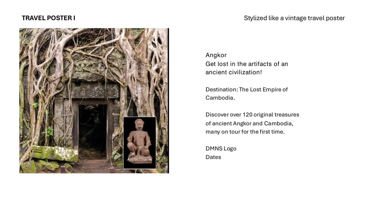
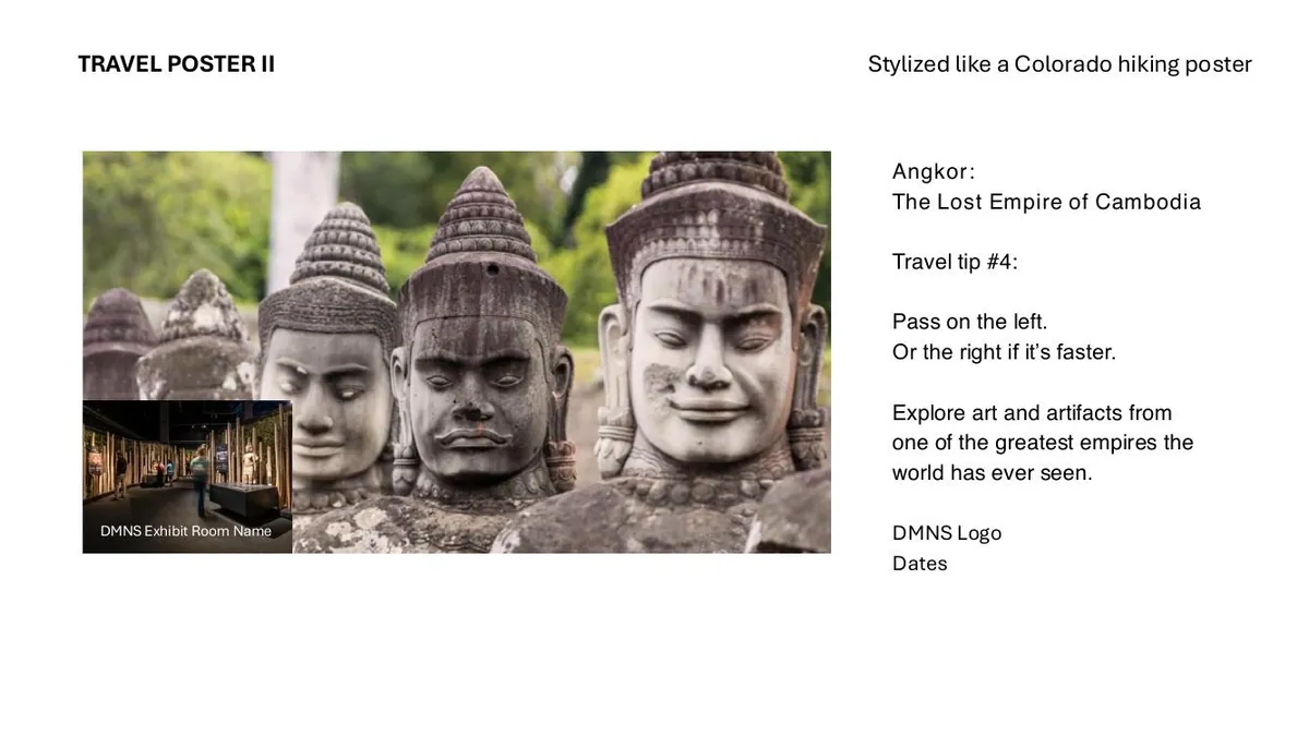
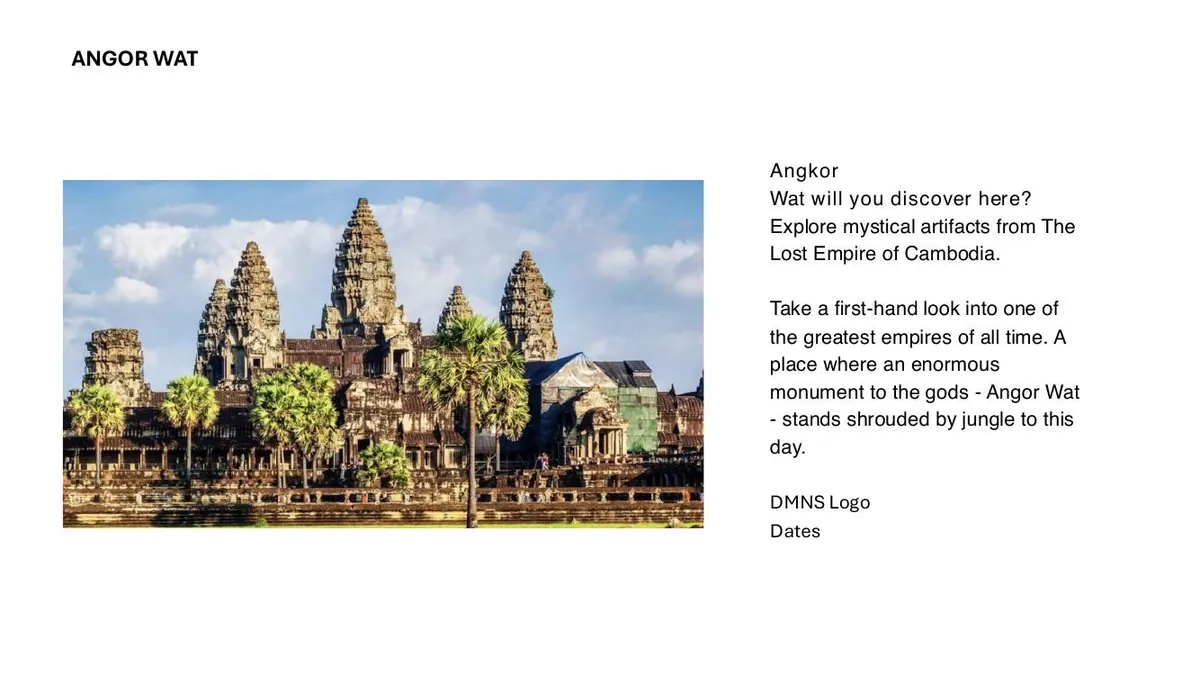
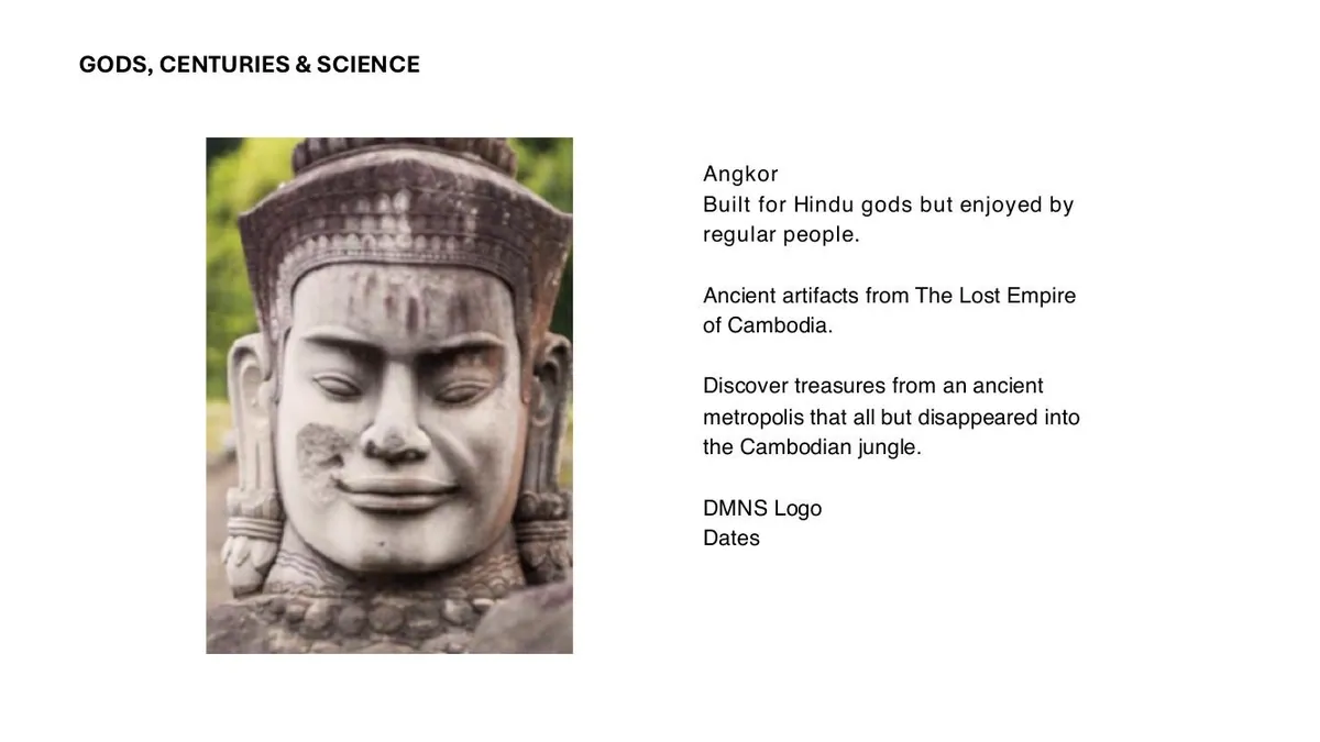
Round one: four directions, kept rough on purpose.
The Process
Gods, Lenders & Strangler Vines
Between client rounds we pushed through four internal rounds of hierarchy, lock-ups and type. We tried a vertical ANGKOR climbing the frame like a temple tower, and the word split across two lines with vines threading through the letters. Not everything survived. The split “ANG/KOR” was striking, but people read it as two words, so it went.
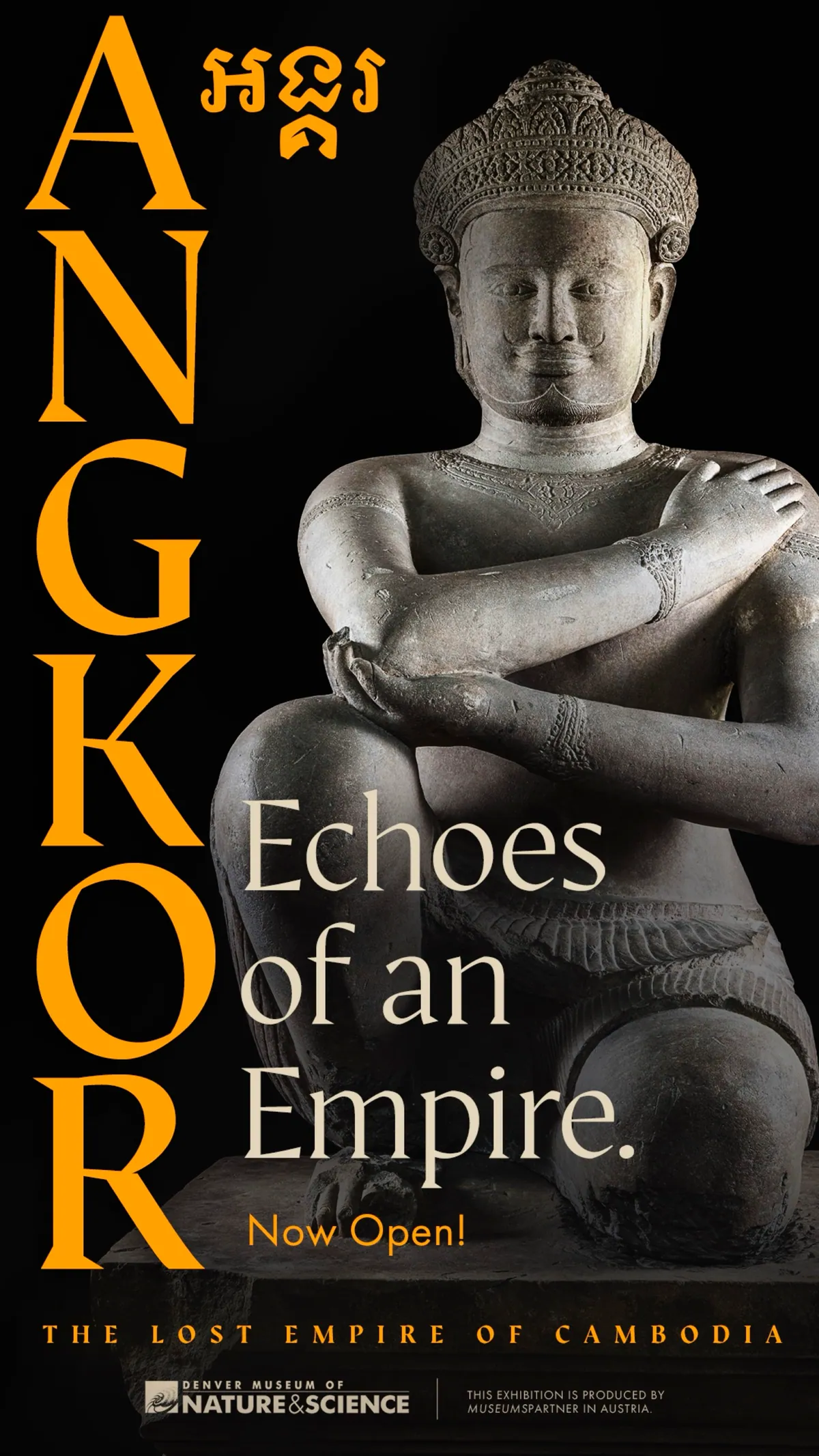
At the Campaign Preview the Museum chose Gods, Centuries & Science. Two image families grew from it. Place: temples, jungle and monks at sunrise. Artifact: Ganesha, the Pandava brothers and the Hevajra shrine, lit like jewels on black. The rule was to use both, but never in the same ad.
Every piece also had to clear the lender in Austria. When a hero photo turned out not to be cleared, we rebuilt it. When our first rebuild came out too close to the photograph that inspired it, we flagged it ourselves and started again. Getting it right mattered more than getting it fast.
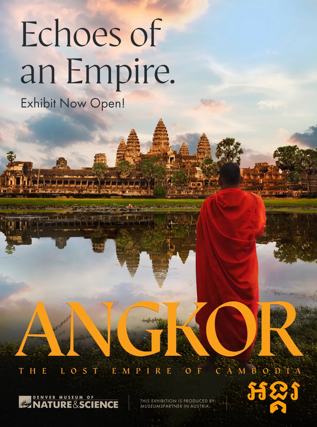
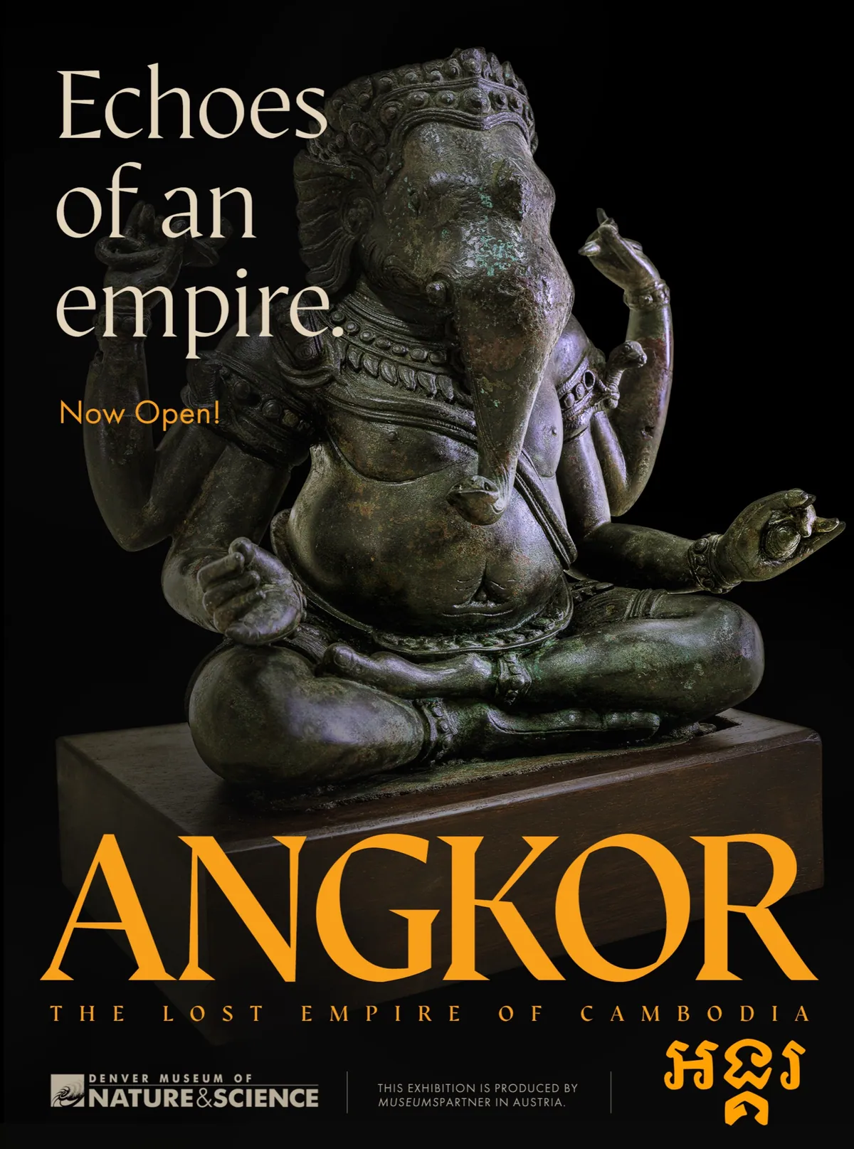
Two image families, place and artifact: never in the same ad.
The Craft
Built Layer by Layer
“Monks Facing Angkor” is a full composite. I rebuilt a licensed sunrise plate of Angkor Wat with my own sky and cloud photography, put the monk on his own layer, and extended the bleed so the same image could stretch from a bus shelter to a 437-inch entrance banner. The jungle-doorway hero, a still from K2’s Angkor IMAX film, was rebuilt and upscaled to hold up at architectural scale.
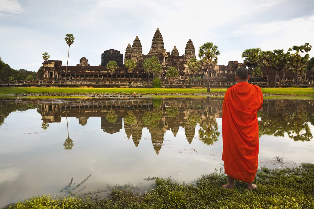
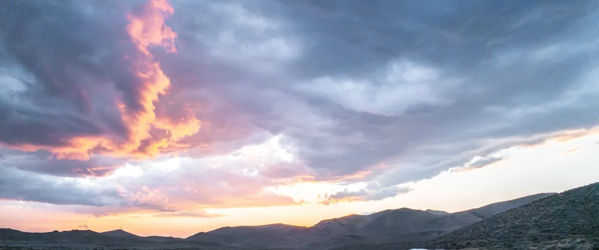
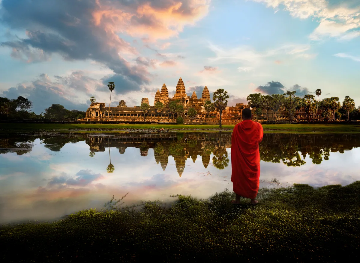
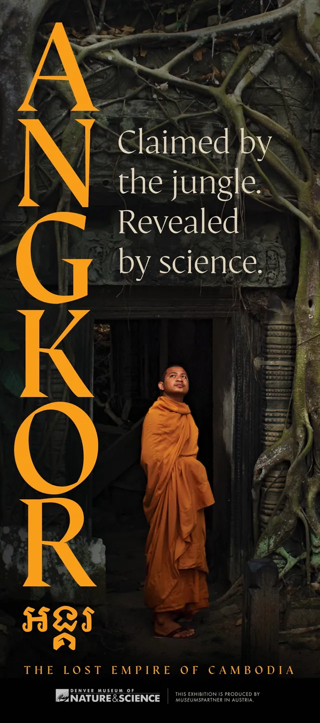
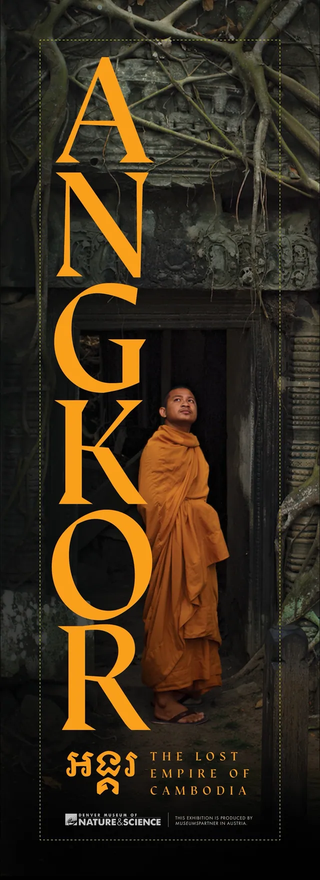
Elevator wrap, street banners: one vertical system.
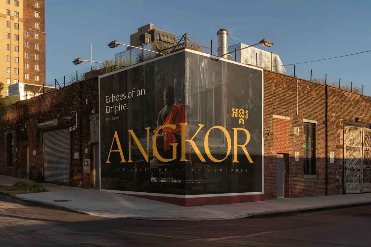
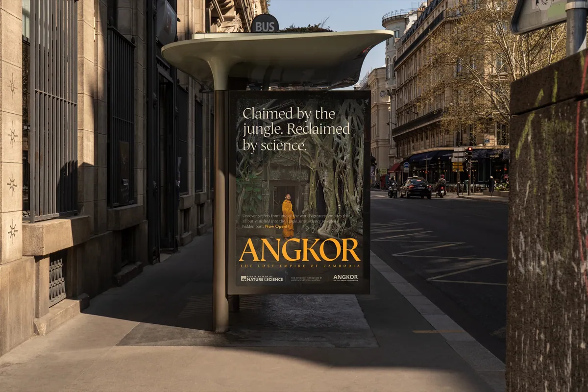
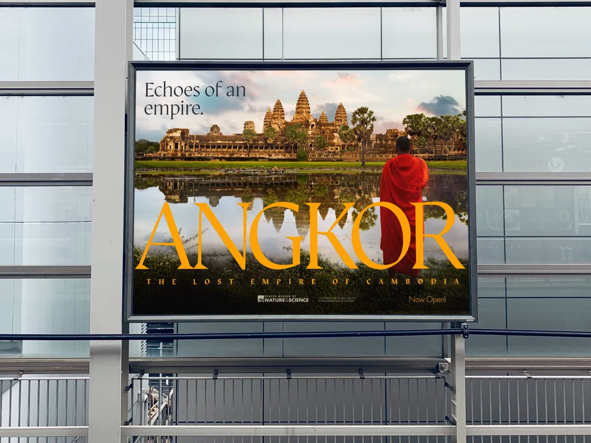
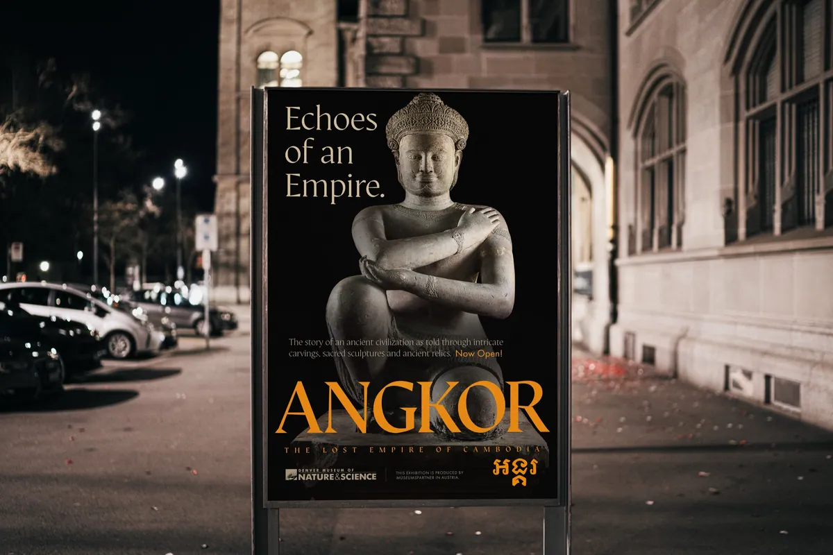
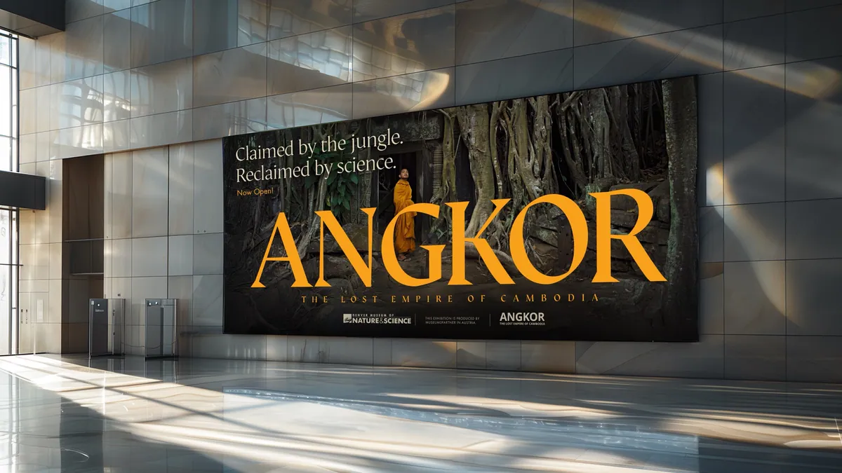
Out of home: building wraps, bus shelters, billboards and posters.
The Mark
A Logo That Moved In
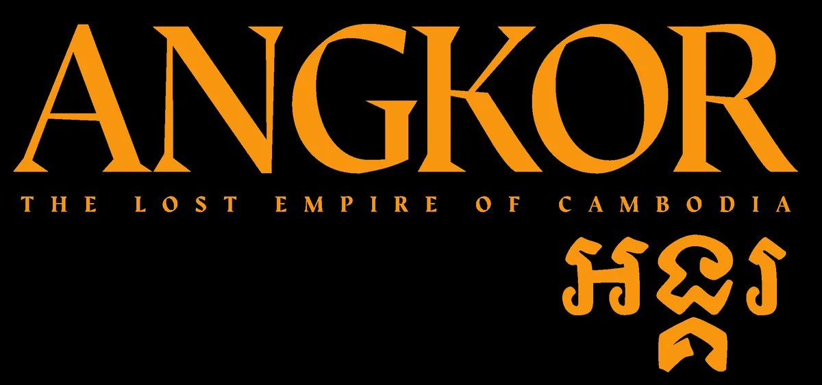
We built the campaign around a tall, confident ANGKOR wordmark in the exhibition’s signature orange, paired with its name in Khmer script. At the final presentation the Museum’s Exhibits team asked to adopt it for the exhibition itself. With the lender’s approval it went from ad campaign to front door.

The Outcome
Outcome
The final campaign paired reverent, cinematic photography with three short, confident headlines: “Echoes of an empire.” “The empire that defied time.” “Claimed by the jungle. Revealed by science.” The system flexed across vertical and horizontal formats, from a towering entrance banner and elevator wraps to 30×86 street banners, a 14×48 billboard, posters and social.
Every piece was delivered as a layered, print-ready mechanical with dielines, safety and bleed built in. It went over a week ahead of the original schedule so the Museum’s in-house team could take it from there.
…never received files with this level of detail and organization.
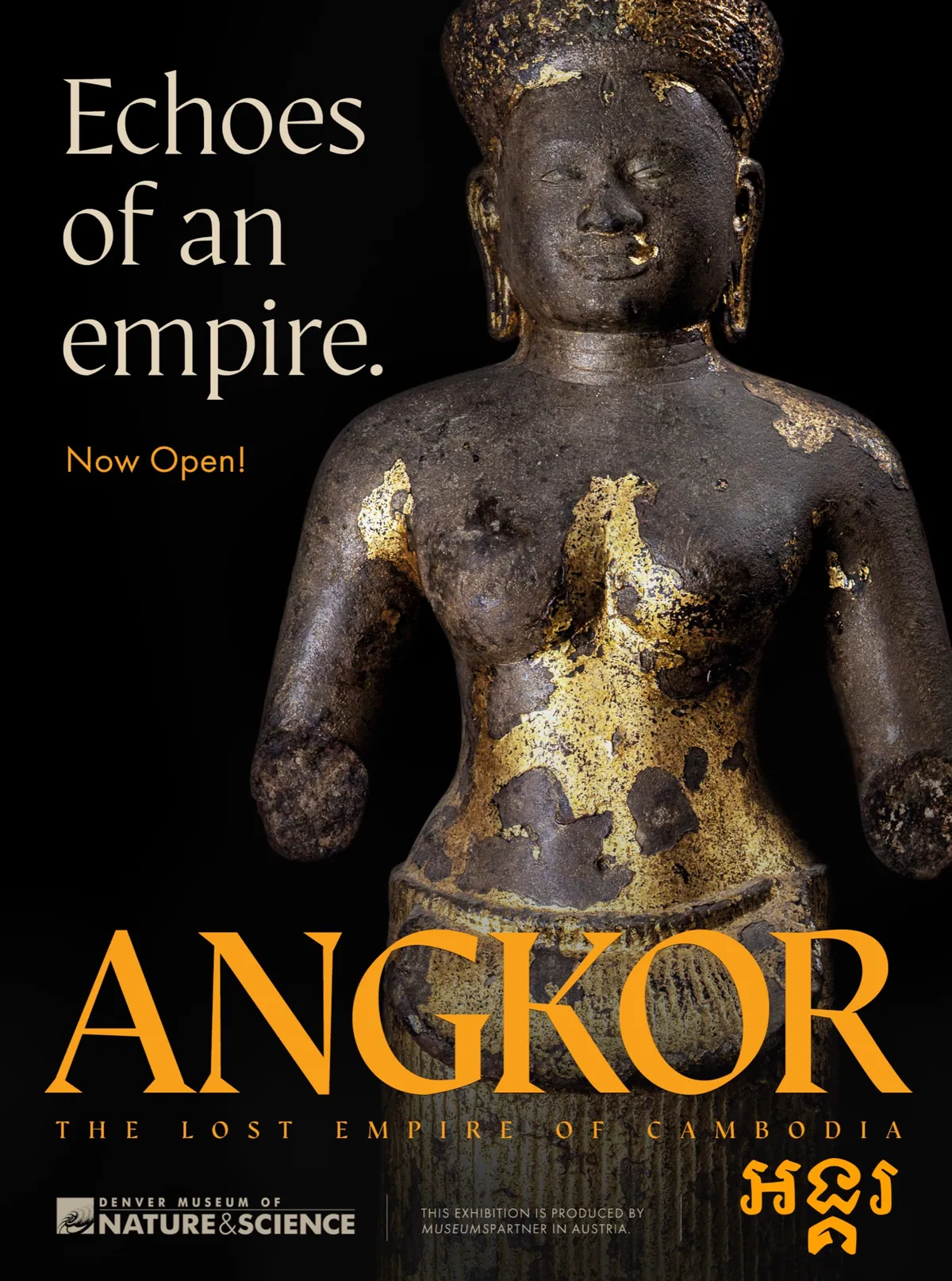
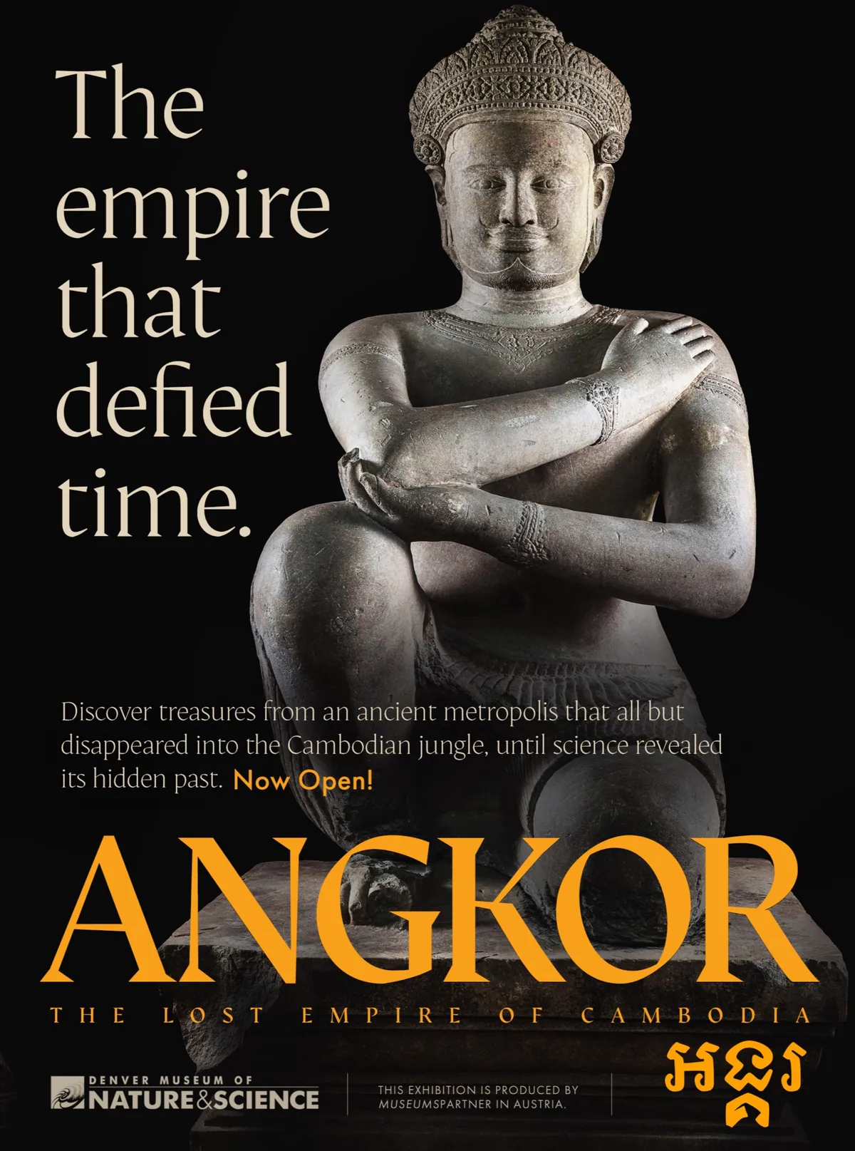
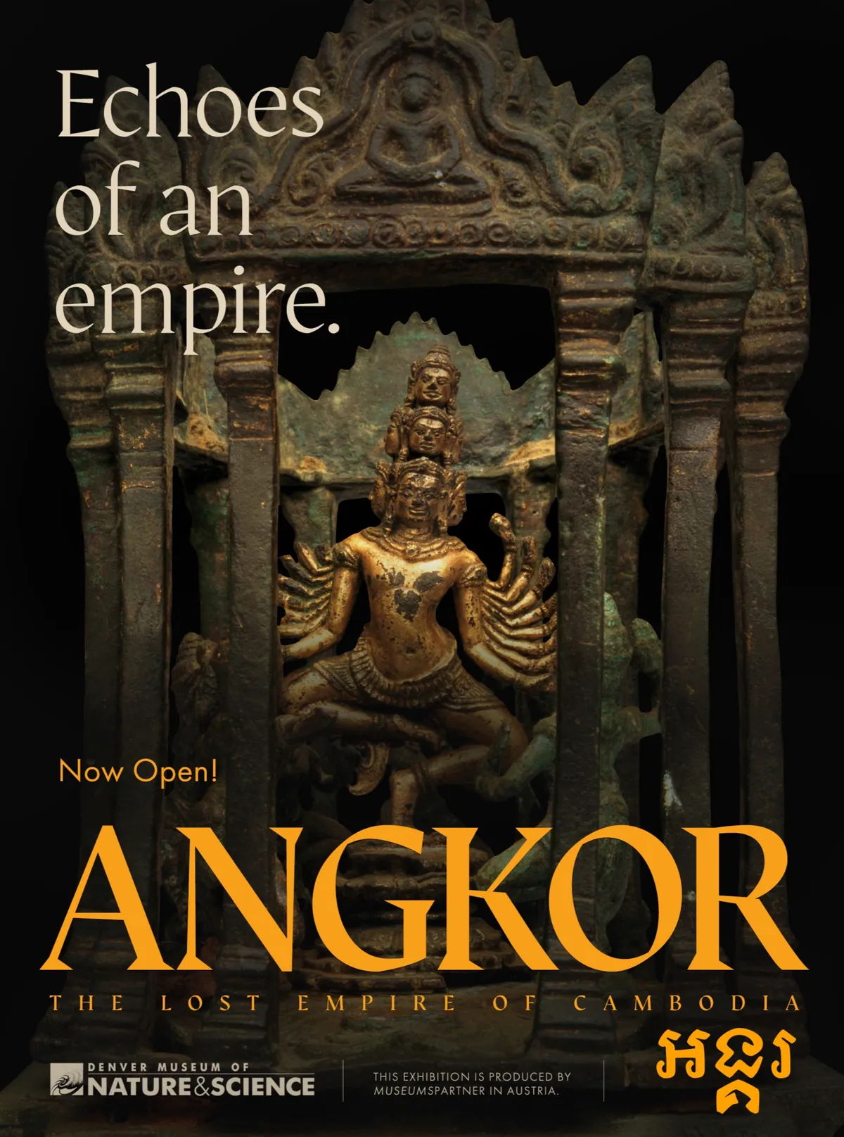
The artifact series.
The Museum Shop
Souvenirs of a Lost Empire
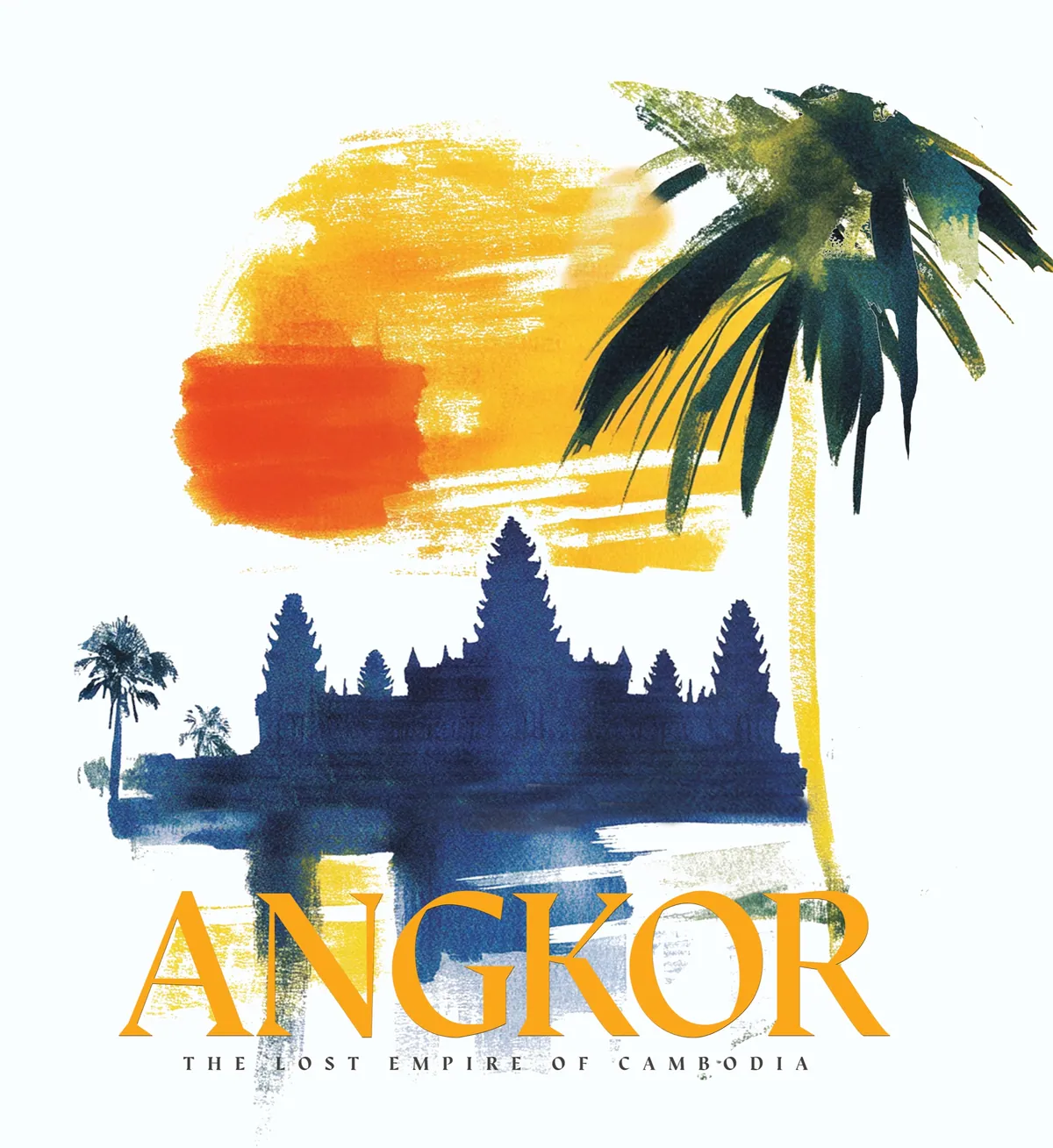
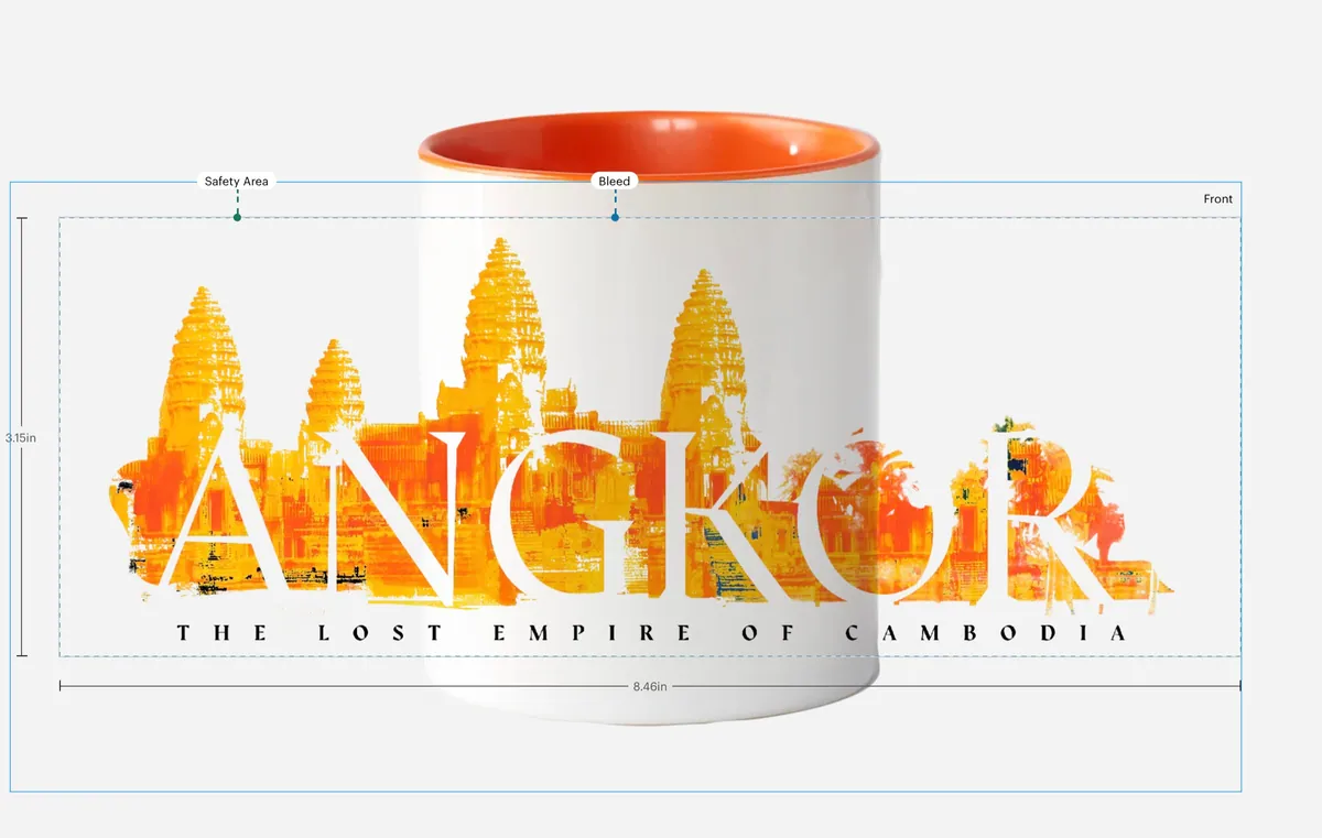
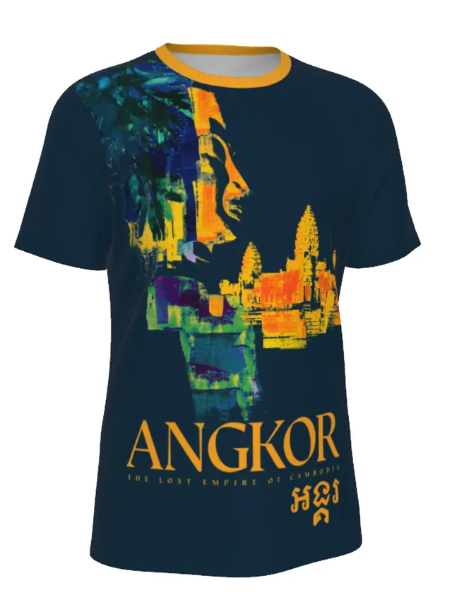
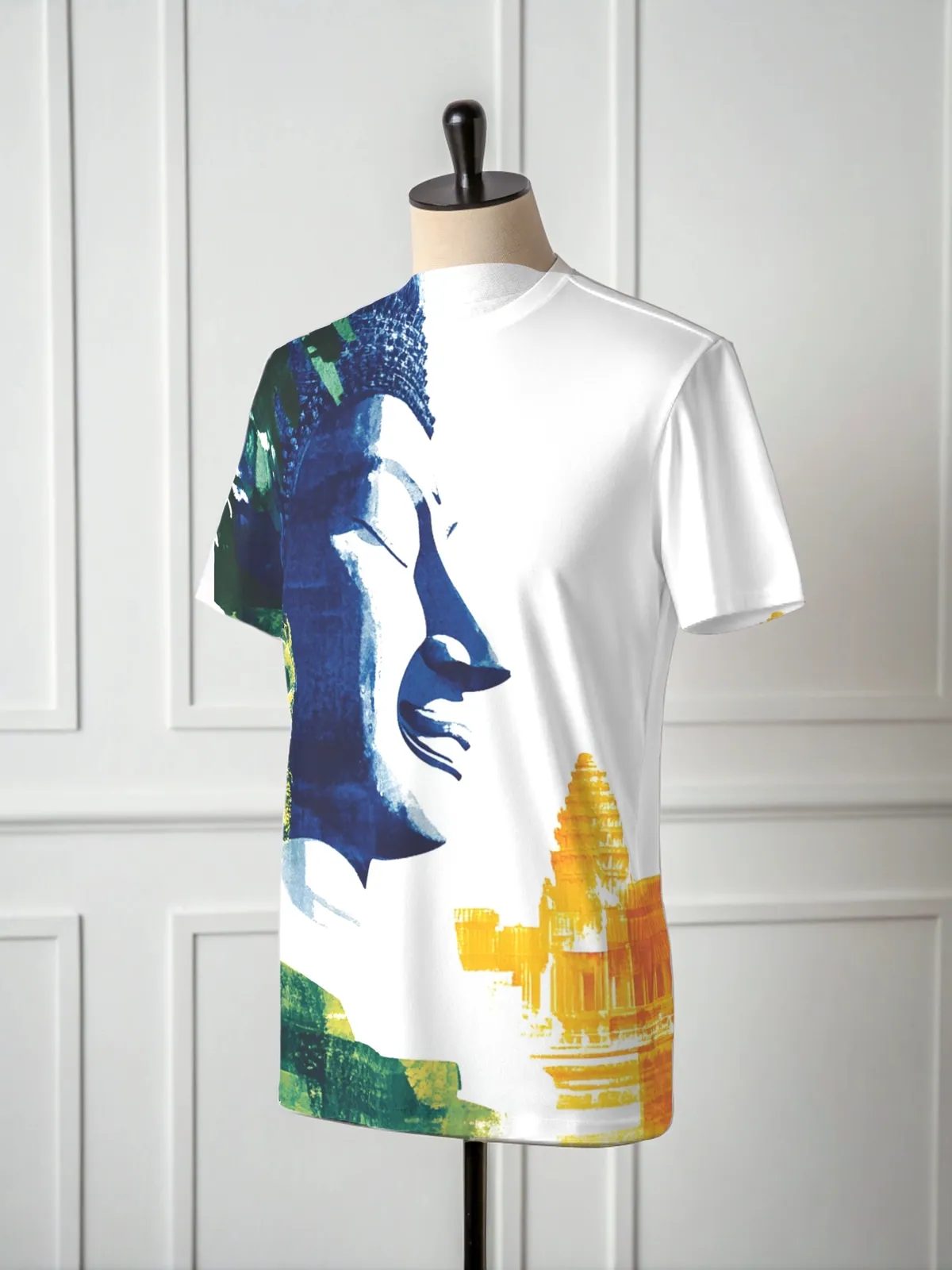
An exhibition this rich deserved something to take home. Alongside the campaign I designed a merchandise collection for the Museum Shop. There’s a watercolor sunset over Angkor Wat for a tote, all-over-print tees in white and navy, and a mug wrapped in an ANGKOR skyline. Each piece carries the campaign’s warm golds and oranges, so the story keeps going long after the visit.
The Impact
Impact
Angkor gave the Museum a campaign as respectful as it was arresting. It introduced a civilization most of its audience had never met, in a voice that felt right for a sacred site and right at home in Denver. The Exhibits team liked the identity enough to make it the exhibition’s own, and the lender in Austria signed off. One campaign became the face of the entire show, from highway billboard to gallery entrance.
Behind the scenes, the Museum’s in-house team received layered, labeled, print-ready files a week ahead of schedule, ready to adapt into anything else they needed. And before the doors even opened, the Museum trusted us with its next major exhibition, Jurassic Oceans: Monsters of the Deep. For us, that’s the true sign of success.