WorkTyndale Momentum
Staring Down an Icon
God & Churchill · Jonathan Sandys & Wallace Henley · Tyndale Momentum
A shelf full of Churchills, one famous scowl, and a seventeen-word subtitle that turned out to be the cover.
- Mission
- Give a book by Churchill’s own great-grandson a cover that could hold its own on a shelf already crowded with Churchills, and treat one of the most recognizable faces in history with respect without making one more history book.
- Outcome
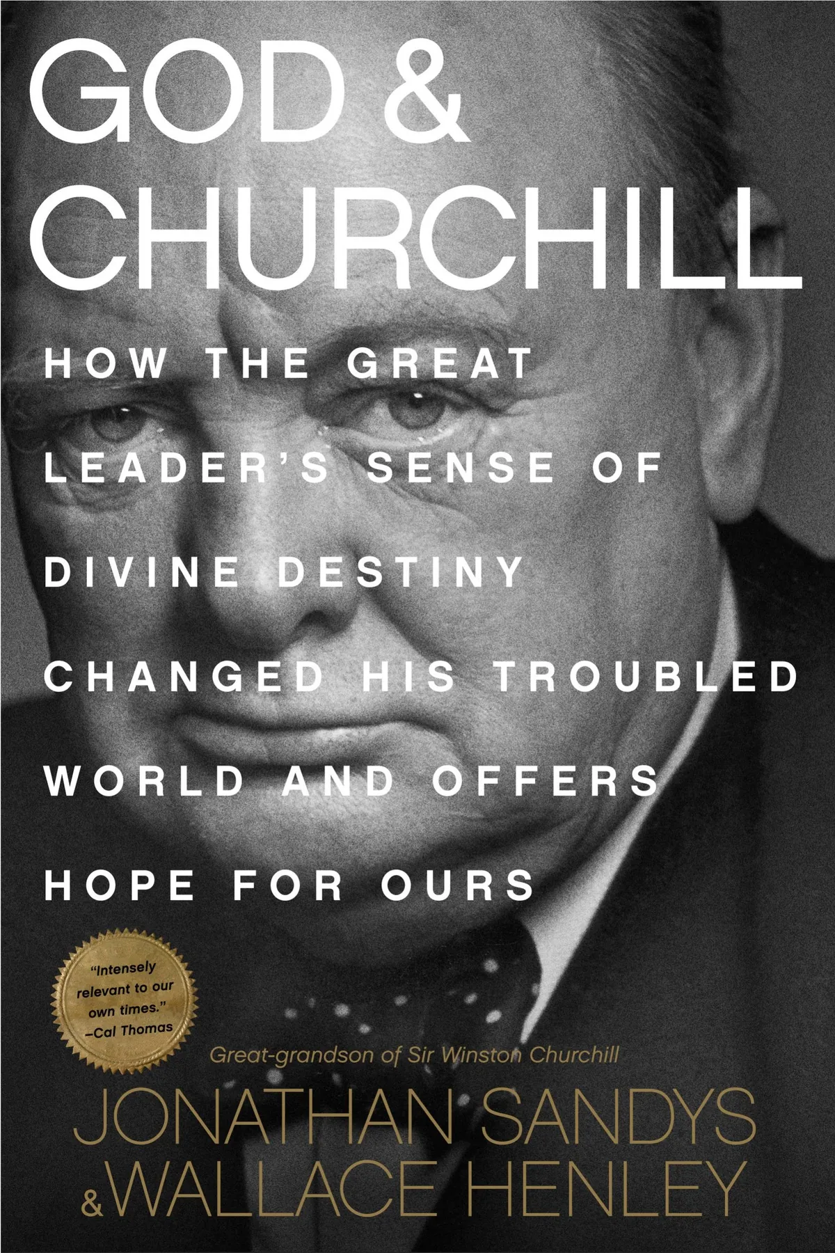
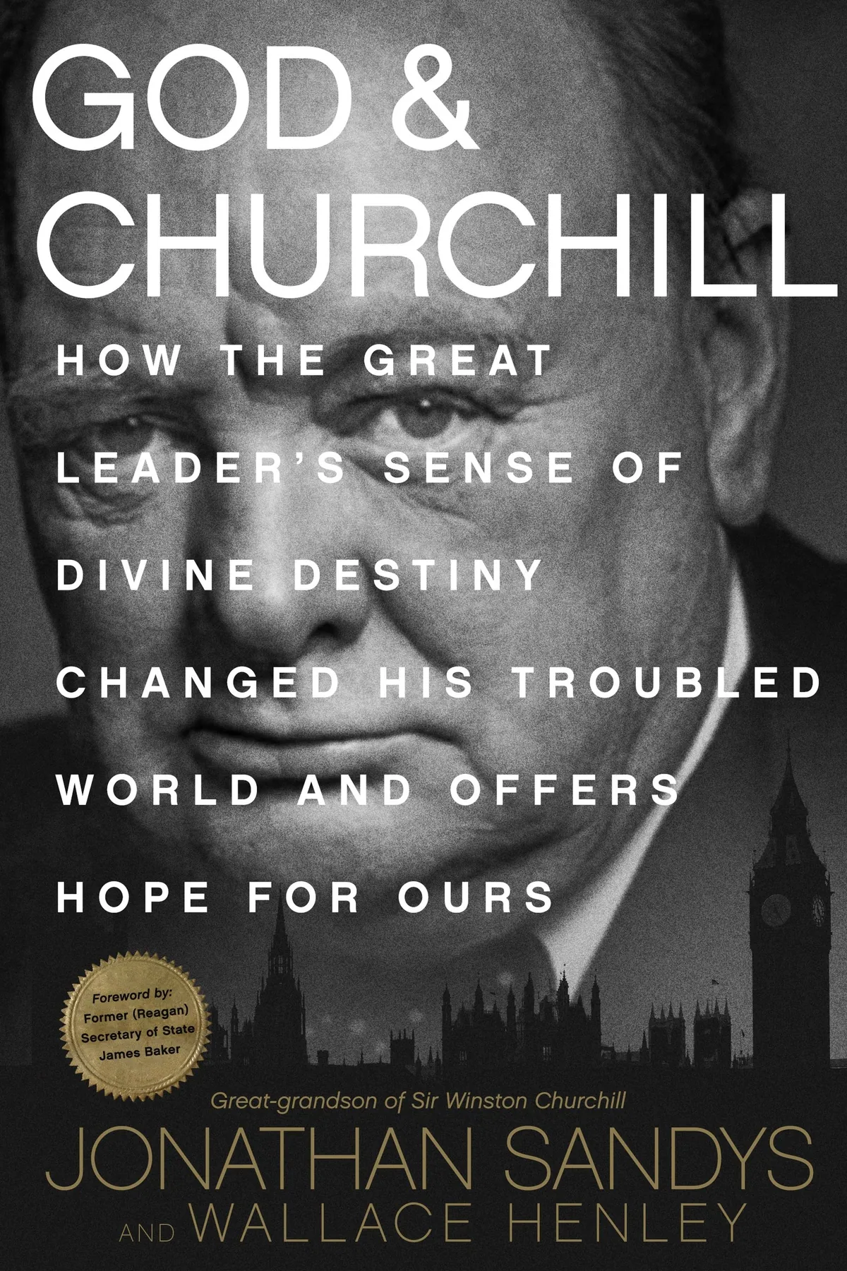
- A black-and-gold hardcover built on Yousuf Karsh’s portrait: the title in plain white capitals, the subtitle stacked across the face, gold kept for the authors. Jacket, printed case and interior pages, designed as one object.
- Impact
- Real presence on a crowded Churchill shelf, warm feedback from the publisher’s team, and a book that set the tone for the Momentum imprint.
Services
Credits
- Cover portrait: Yousuf Karsh
The brief
The Legacy of an Iconic Figure
Tyndale Momentum had a book with a claim no other Churchill book could make: his great-grandson co-wrote it. Jonathan Sandys and Wallace Henley set out to answer the question printed on the back of the jacket. What drove Churchill to greatness?
Their answer starts with a sixteen-year-old schoolboy telling a friend that one day he would save London and England from disaster. A sense of destiny, and where it came from. That’s the book.
The cover had to carry that claim, and treat one of the most recognizable faces in history with respect, without becoming one more history book.
Research
A Shelf Full of Churchills
Research did the heavy lifting here. I pulled every photograph of Churchill I could find, and every Churchill cover already on the shelf, dozens of them. Side by side they blur: the cigar, the V sign, the hat, the name in enormous type.
When everyone already knows the face, the hard part is getting anyone to look at it again. So the wall had two jobs: show me what had been done to death, and show me what nobody had tried.
I also went looking for period ornament. Engraved labels, rules and flourishes, the kind of detail that could dress a jacket in gold without shouting.
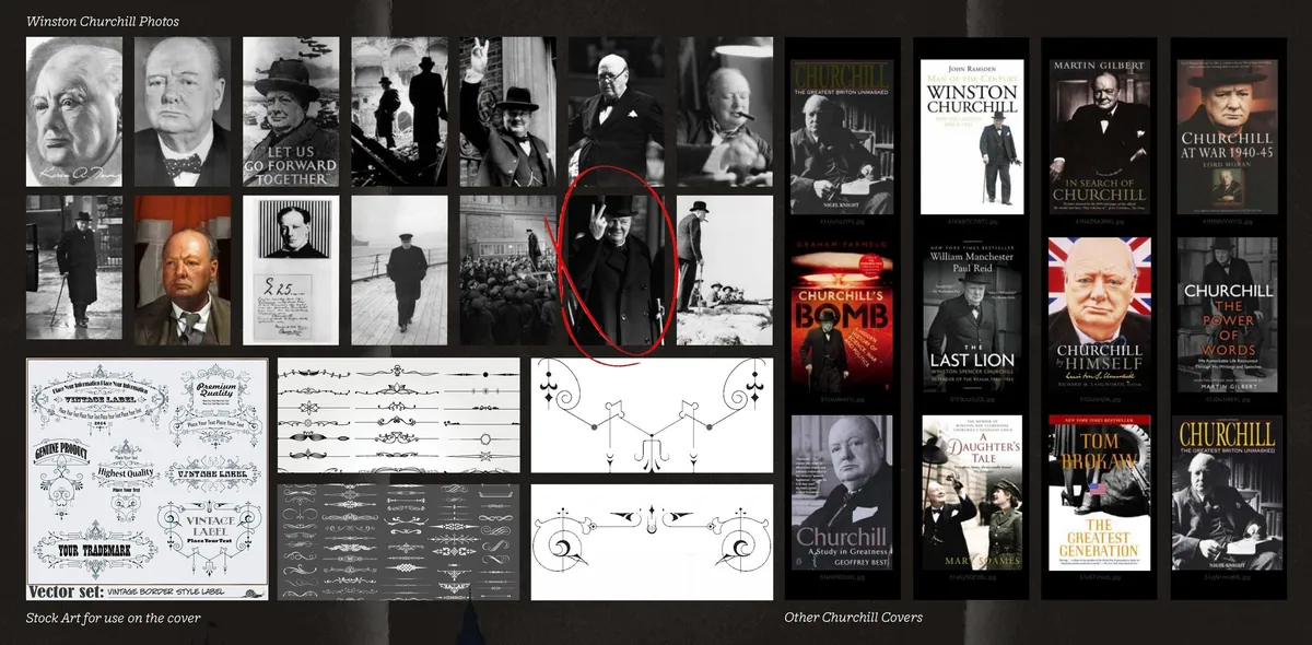
The wall: Churchill in photographs, period ornament for the jacket, and the shelf the book would have to stand on.
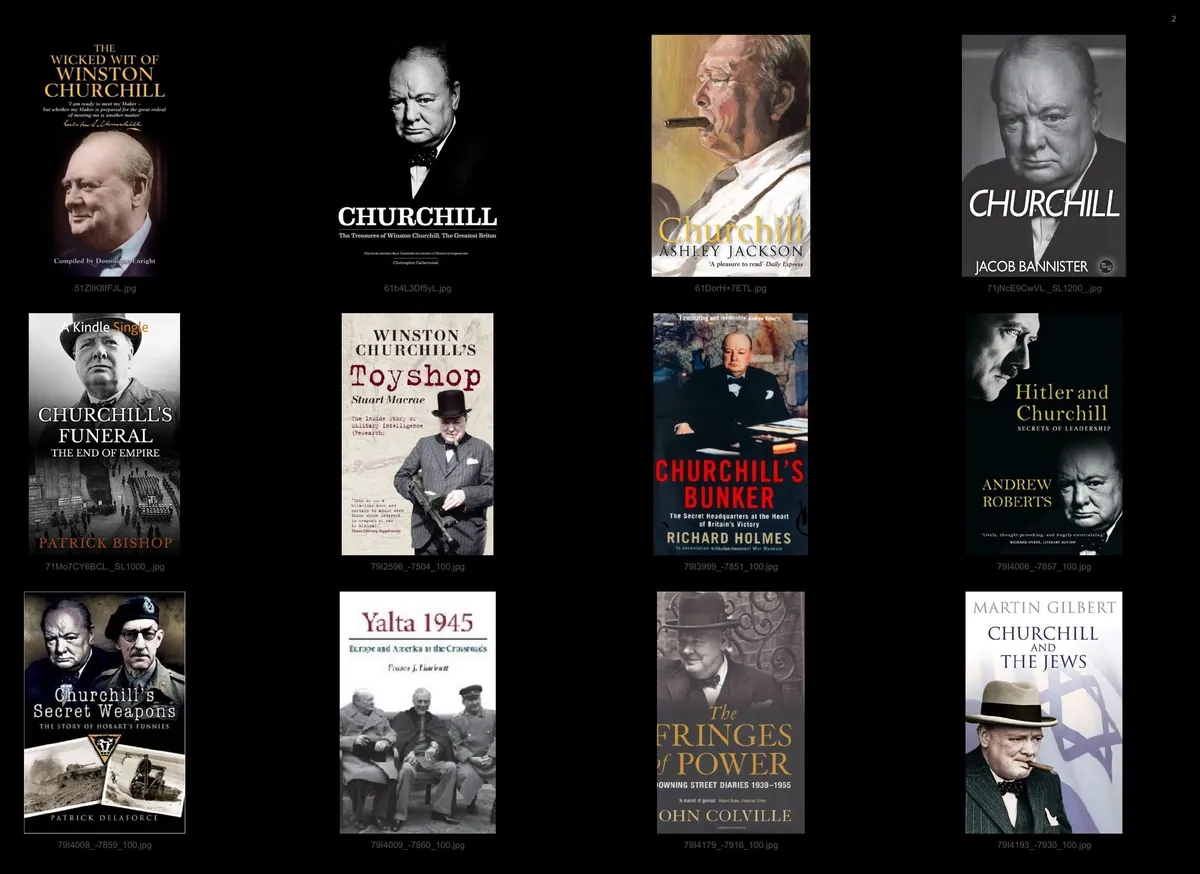
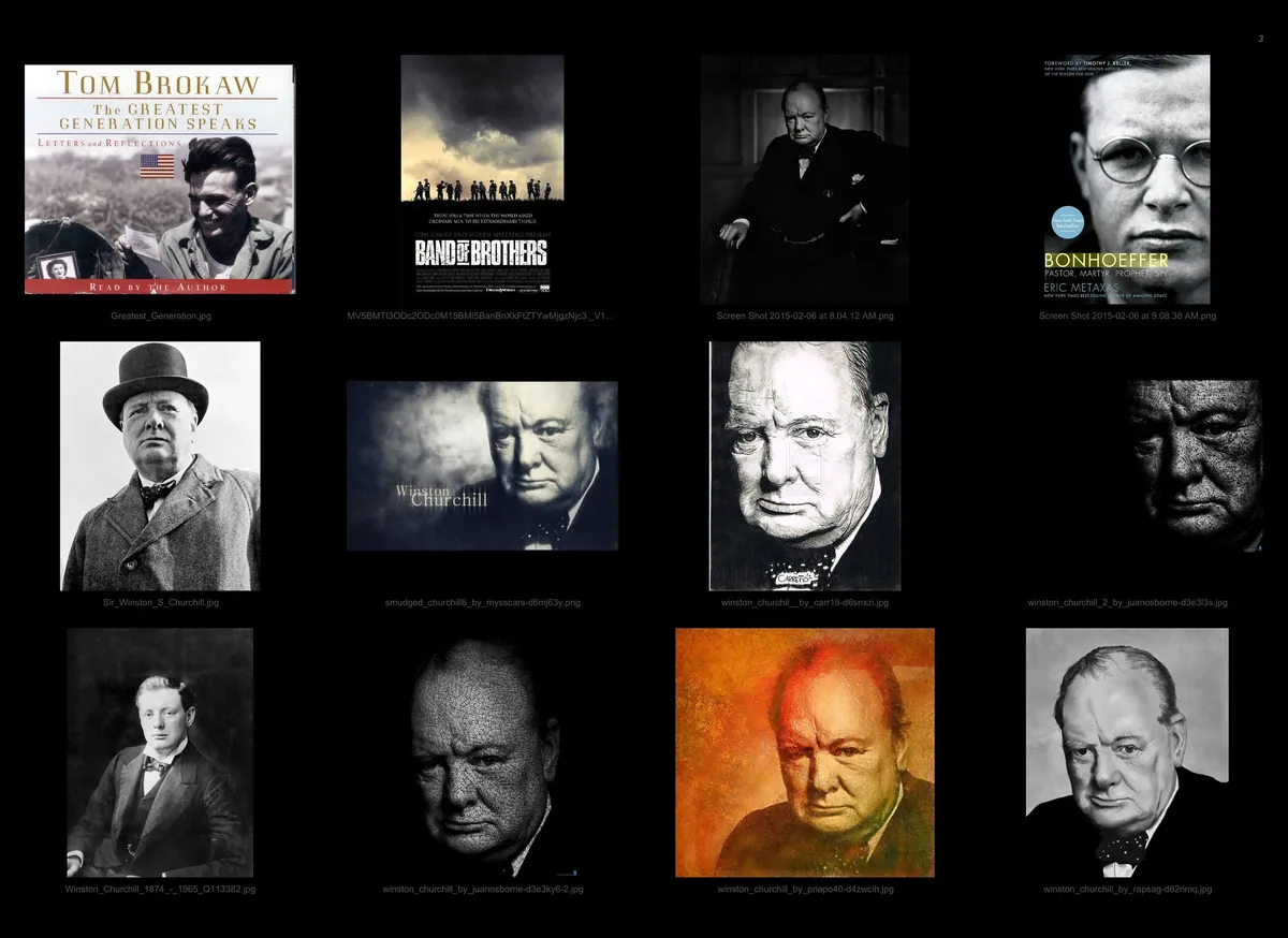
More of the shelf, and the hunt for the right face.
First ideas
Anything but a Photograph
So the first ideas ran the other way. Churchill’s face built entirely out of three words: never give up. Churchill painted in hot orange, like a poster for a film. Churchill in slabs of raw color.
Each was a fresh way to see him. And each had the same flaw: you looked at the idea, not at the man. The photographs kept winning.
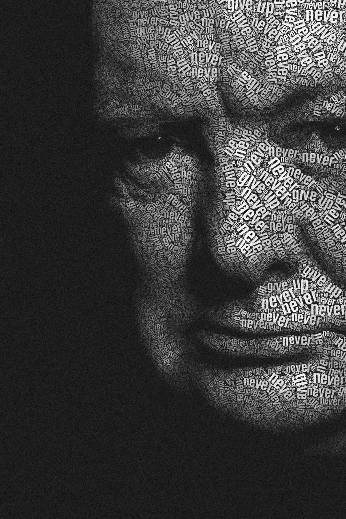
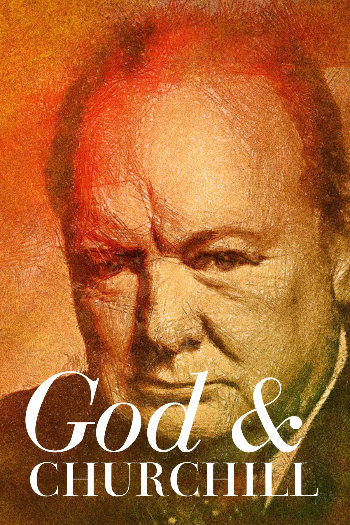
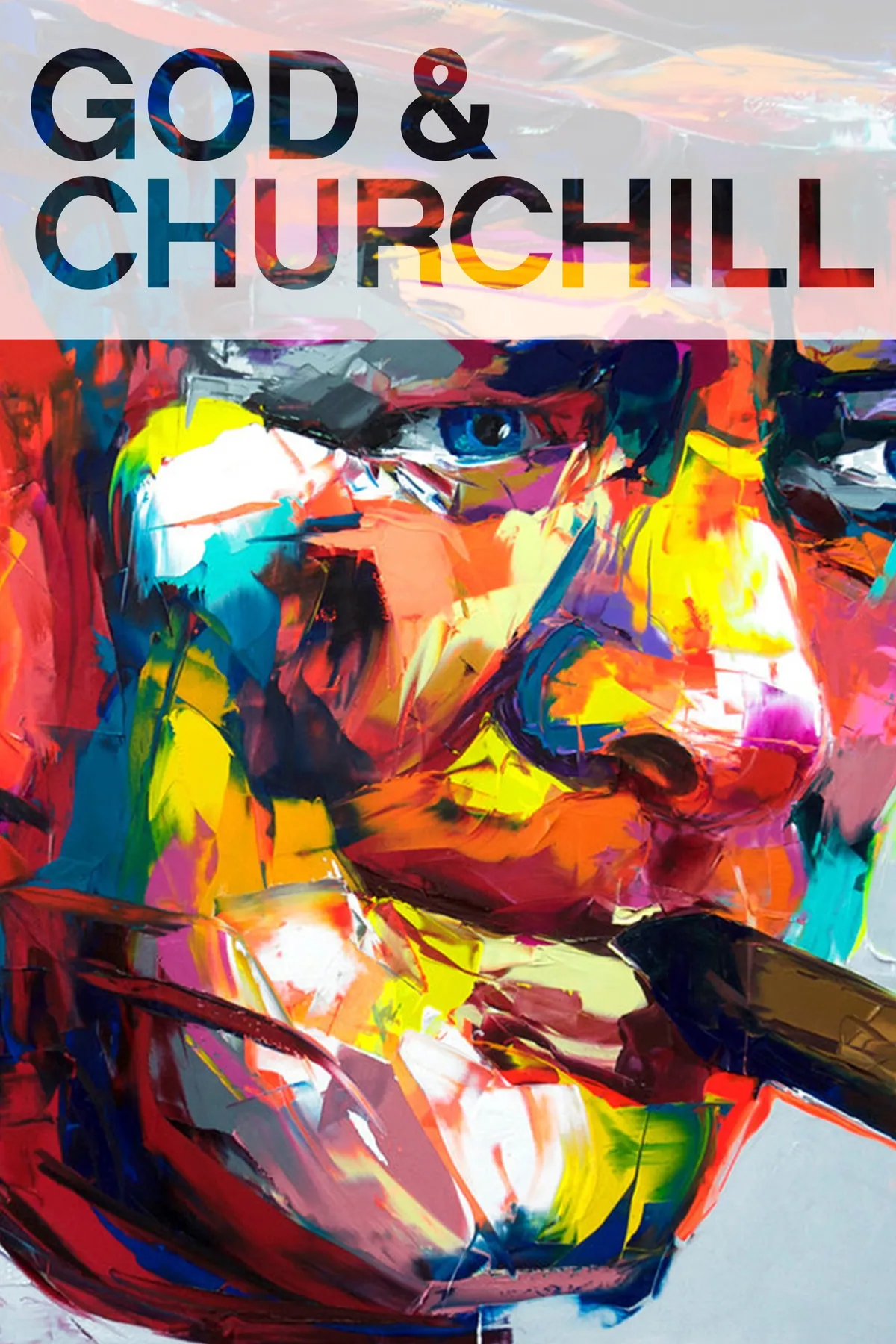
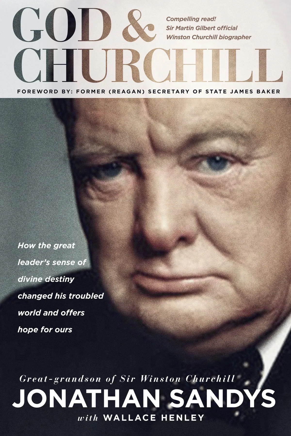
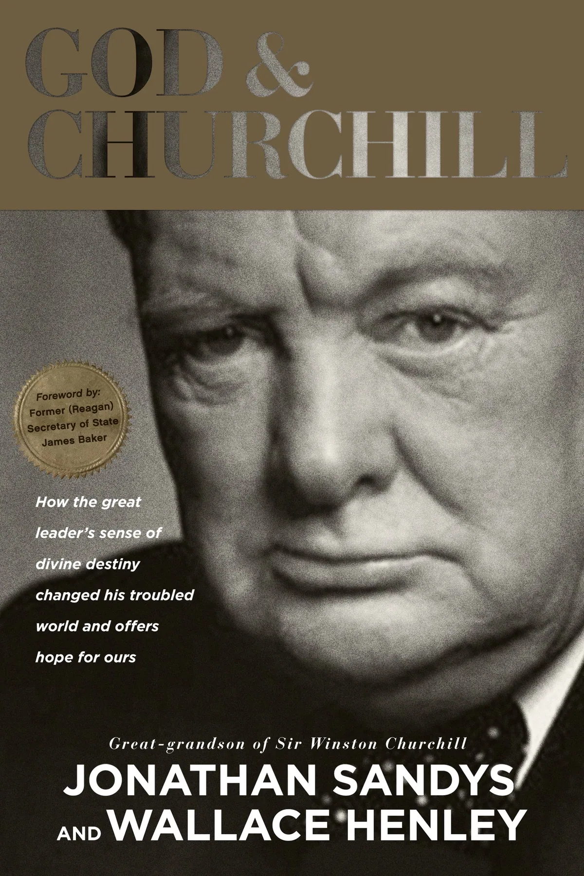
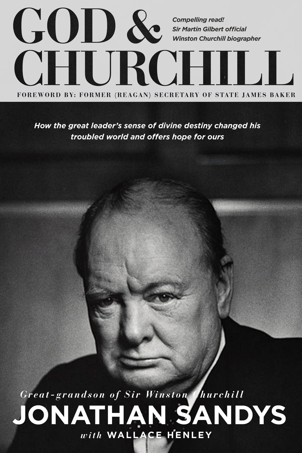
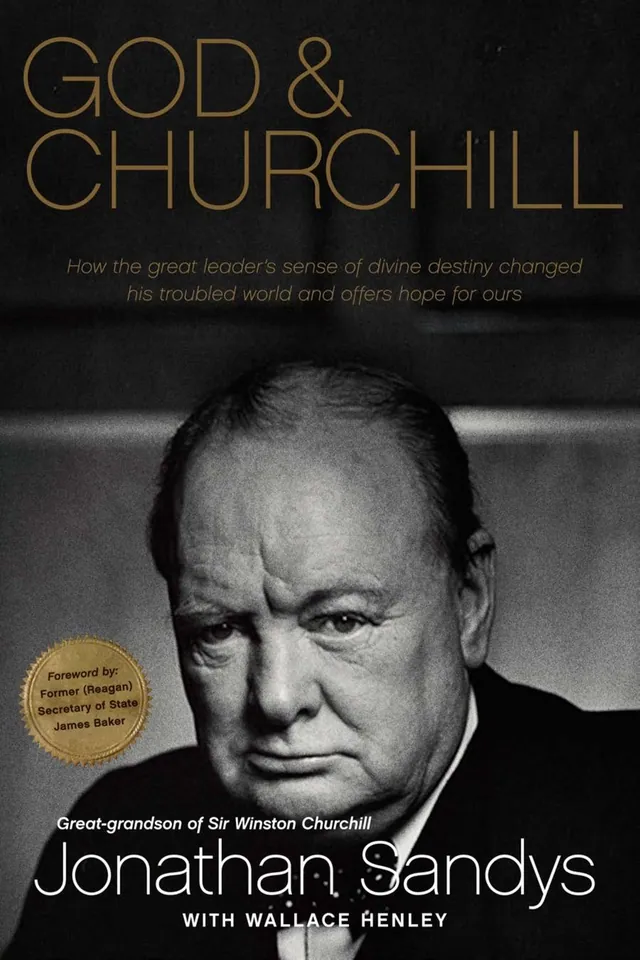
Early comps and alternative covers. Three ways round the photograph, then three ways into it.
The portrait
The Most Famous Scowl in Photography
Then we found the portrait. Yousuf Karsh’s Churchill: the jaw, the glare, the hand on the hip. The story goes that Karsh got that look by plucking the cigar out of the great man’s mouth a moment before the shutter.
It comes with strict conditions on how it may be used, and the rights took some securing. Worth every email. No clever picture of resolve was ever going to beat the real thing.
The rounds
Getting Out of His Way
With that face on the cover, the job changed. It was no longer to make something striking. It was to get out of his way.
Round by round with the Momentum team, things came off. The serif titles went first: handsome, and exactly what a history book is expected to wear. The full portrait went next. Standing back, he’s a statesman. Up close, eye to eye, he’s a man deciding something.
Then the subtitle. Seventeen words is usually a designer’s headache, something to set small and hope nobody minds. Here it’s the whole argument of the book, so it became the cover: widely spaced capitals, stacked six lines deep, laid right across his face. You read the claim through the stare.
The Houses of Parliament turned up along the bottom for a round. The printed jacket went without them. He doesn’t need a caption.
When you work on a project with Stephen—and you’d be crazy not to—you’ll be amazed by the level of both detail and big picture thinking he brings to the process and the project.
The object
Black, Gold and Nothing Else
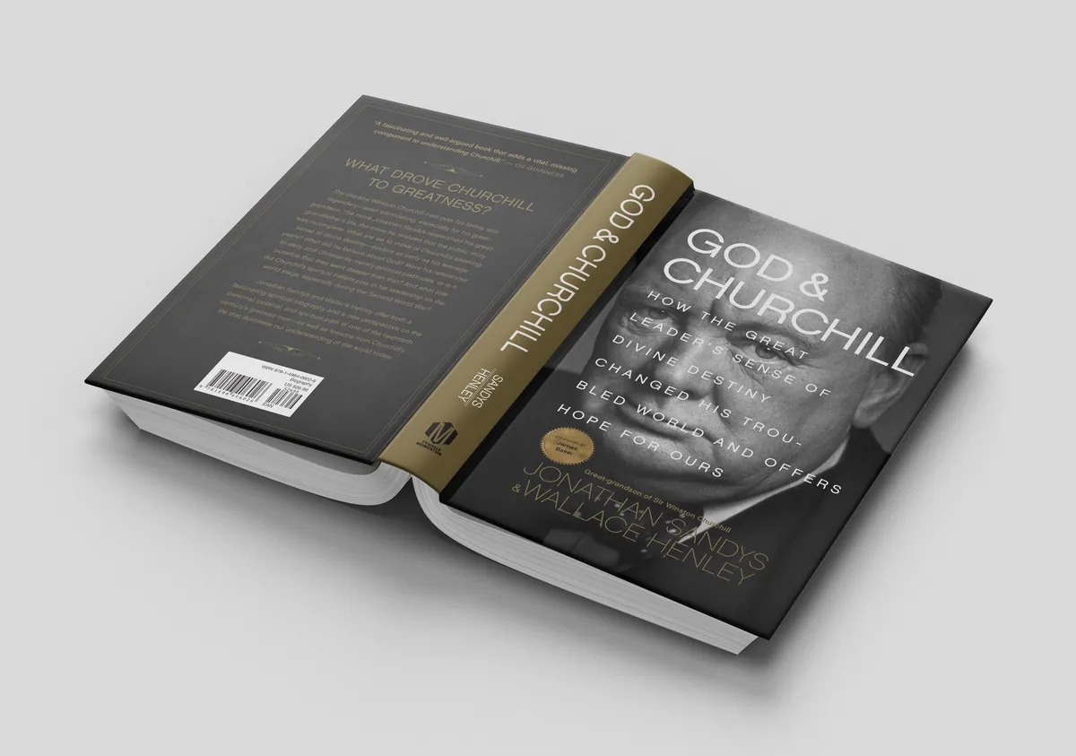
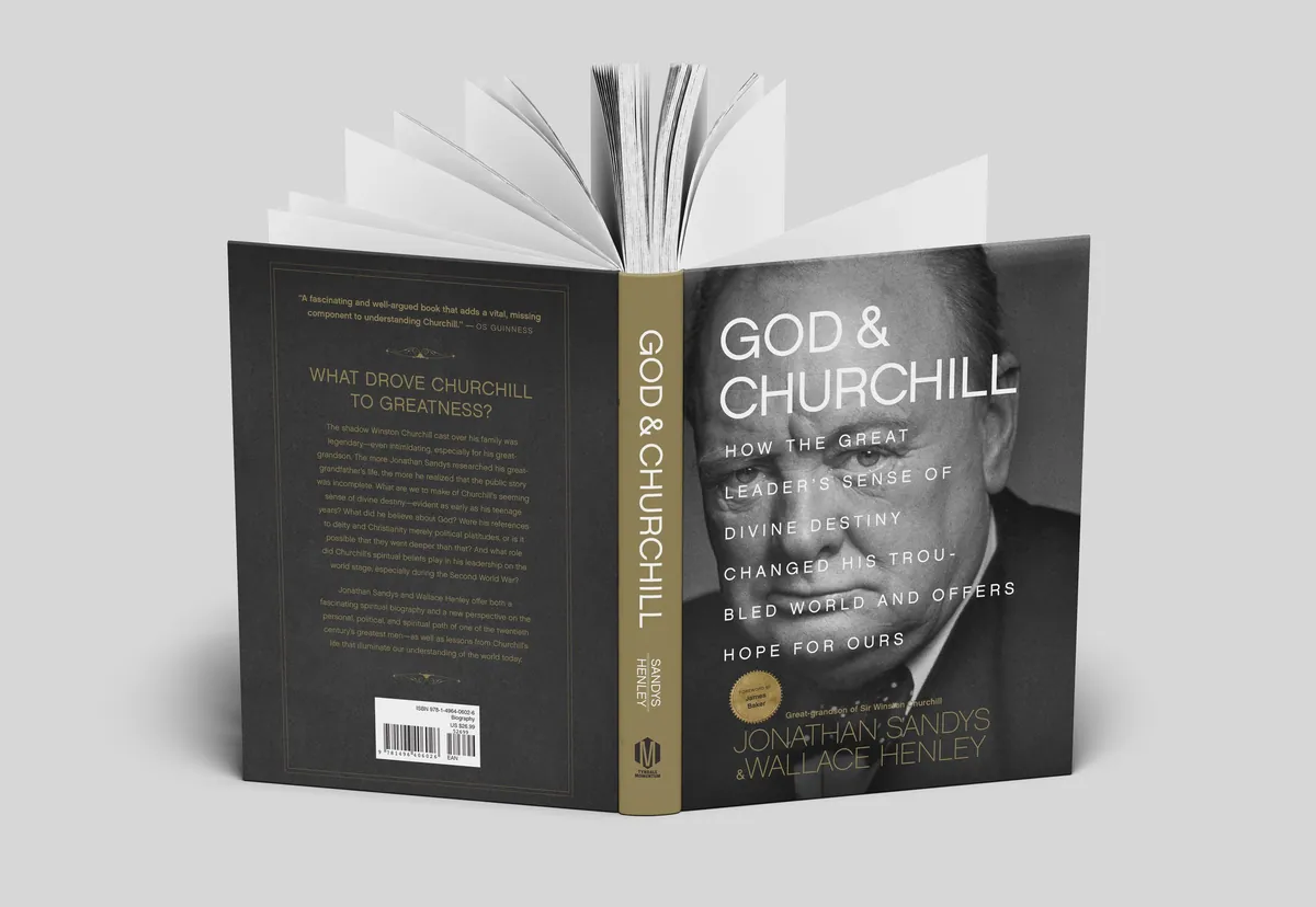
A book about destiny should feel as if it was always going to look this way. So the palette is two colors. Black for the weight. Gold for the authors’ names, the spine and the fine ornament that frames the flaps and the back.
Under the jacket the case is printed too, with the same gold detail. Take the jacket off and the book is still dressed.
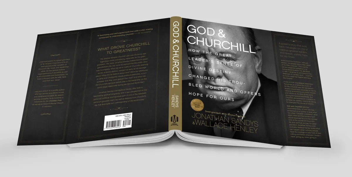
Front, spine, back and flaps: one black field, one gold.
Inside
All the Way Through
I designed the pages as well. Each part of the book opens on a black page, so every section begins the way the cover does. Chapter openings get room to breathe: a number, a title, one of Churchill’s own lines, and a good deal of white.
Most readers will never notice the typesetting, which is the point. They only notice that the book feels like one thing, from the jacket to the last page.
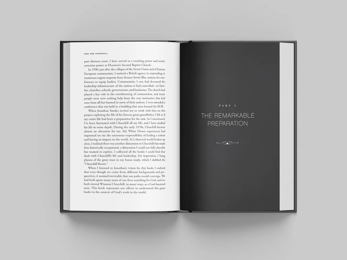
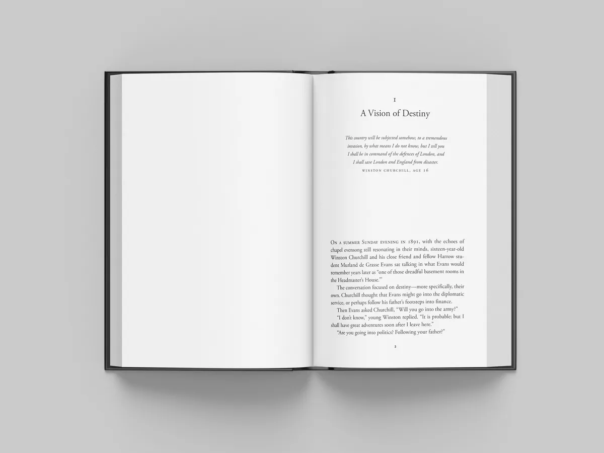
A part opener and a chapter opening.
The outcome
Covering an Icon
The finished book is a hardcover that looks you in the eye from across the shop. It gave the title real presence on a crowded shelf, drew warm feedback from the publisher’s team, and set the tone for the Momentum imprint.
And it looks nothing like the rest of the shelf. Same man, same century, a photograph everyone has seen. The way to make people look again turned out to be standing closer.
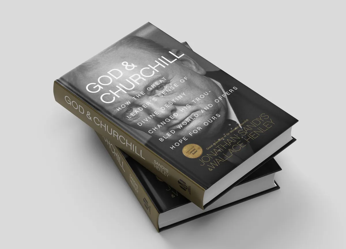
The hardcover, jacket on.