WorkCommercialIdentity

Pondhoppers

A staffing company that wanted to feel like a leap, not a form. Three routes to a mark, and the frog that got the job.

  • Staffing company
  • Identity
  • Logo Design
  • Stationery
  • Web Graphics

13 pieces

  1. The frog mark in white line on the company's green.
  2. A frog drawn in one grey line, sitting, on a pale ground.
  3. pondhoppers in thin grey lowercase on black, the h drawn in blue with a loop beneath it.
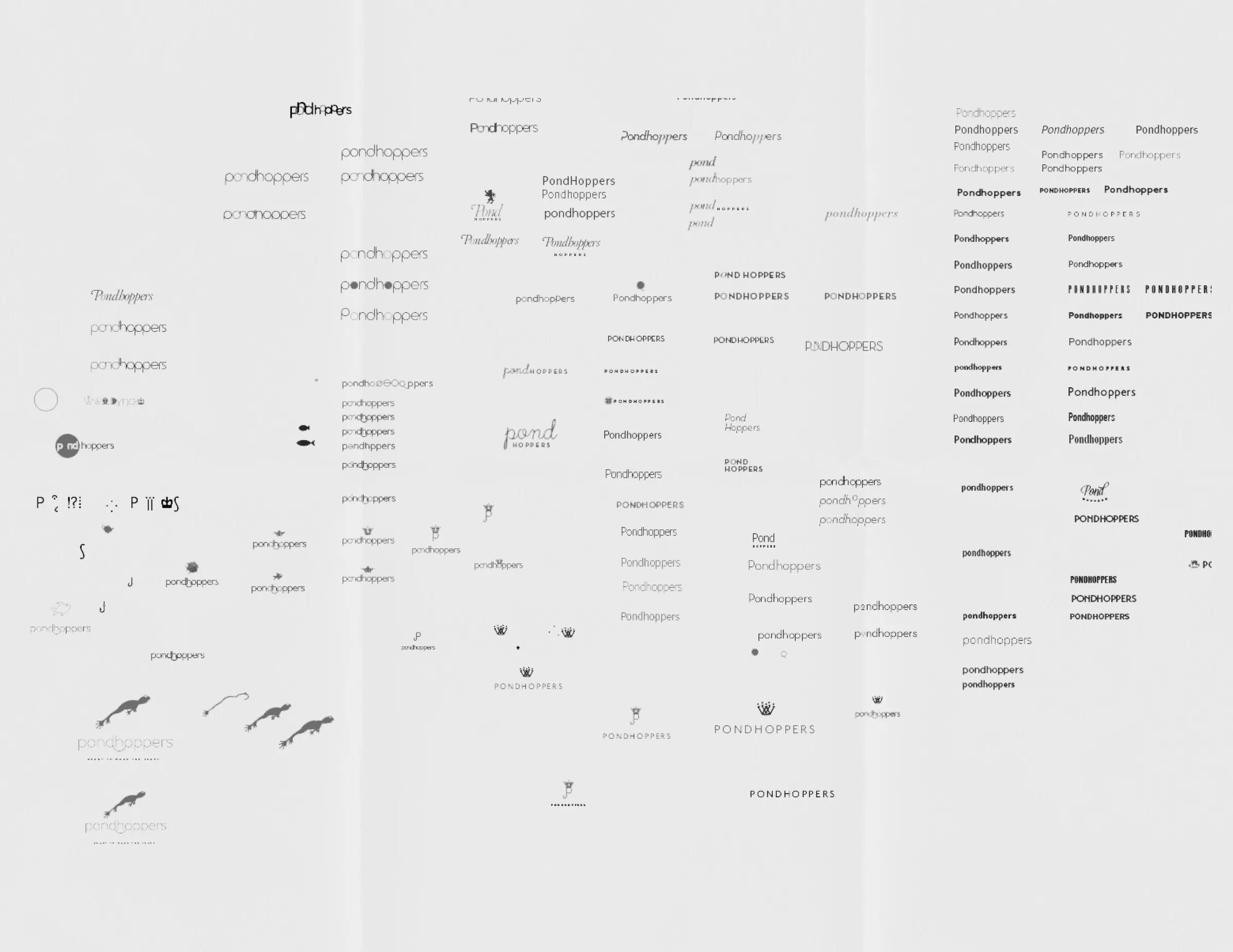
  4. A sheet of dozens of small wordmark and symbol trials.
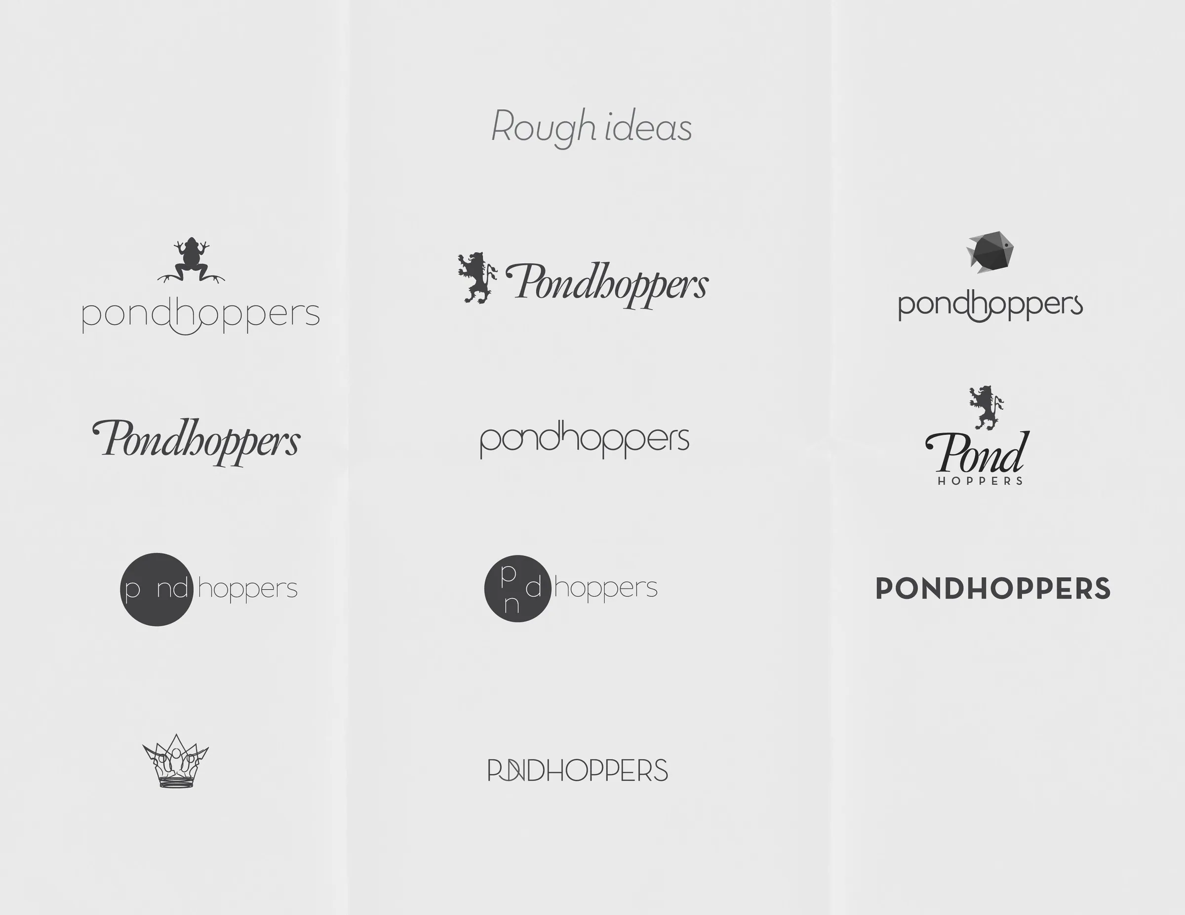
  5. Rough ideas: ten different wordmarks for the name, in scripts and capitals, some with small frog marks.
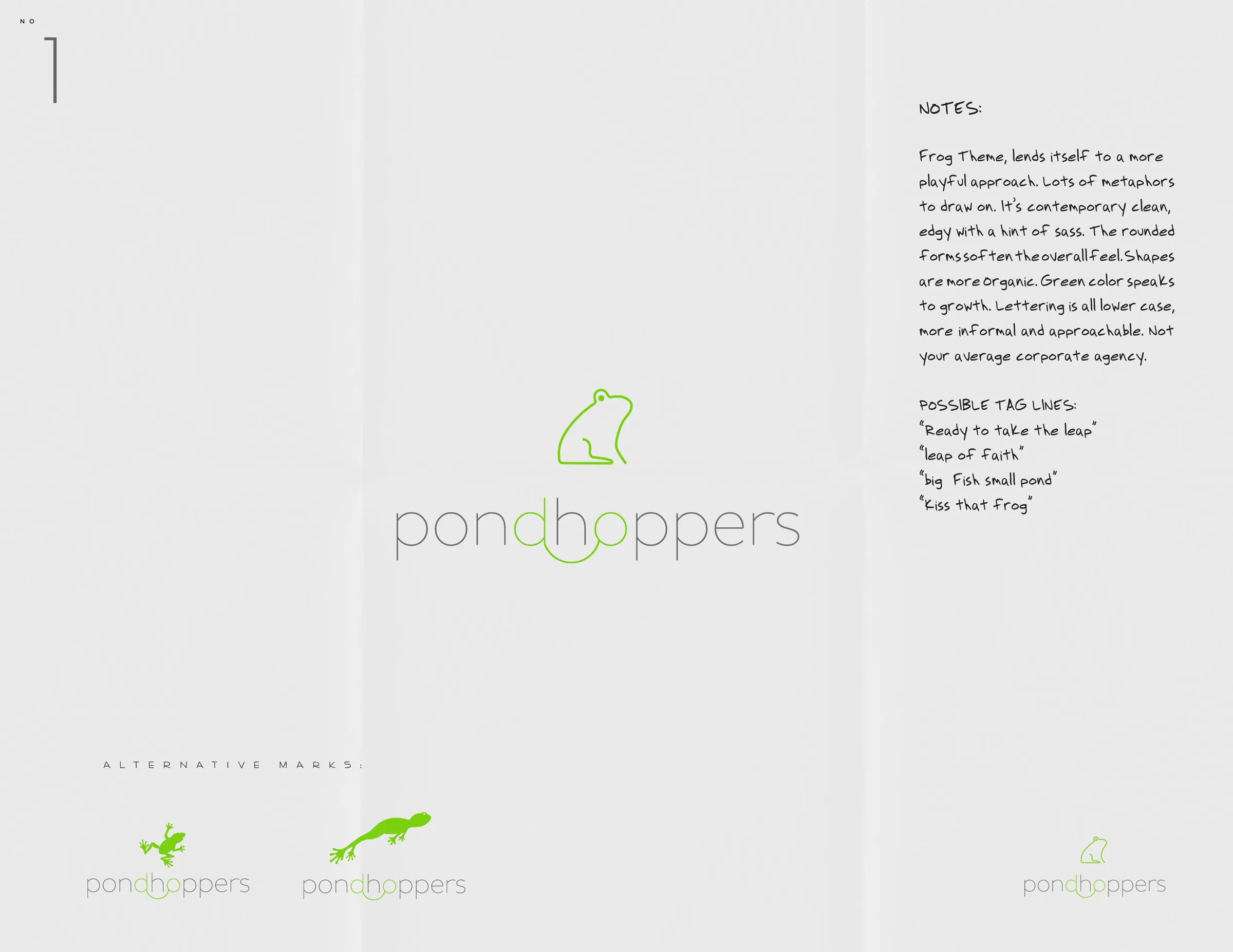
  6. Route one: the line frog above the wordmark in green, with notes and alternative marks.
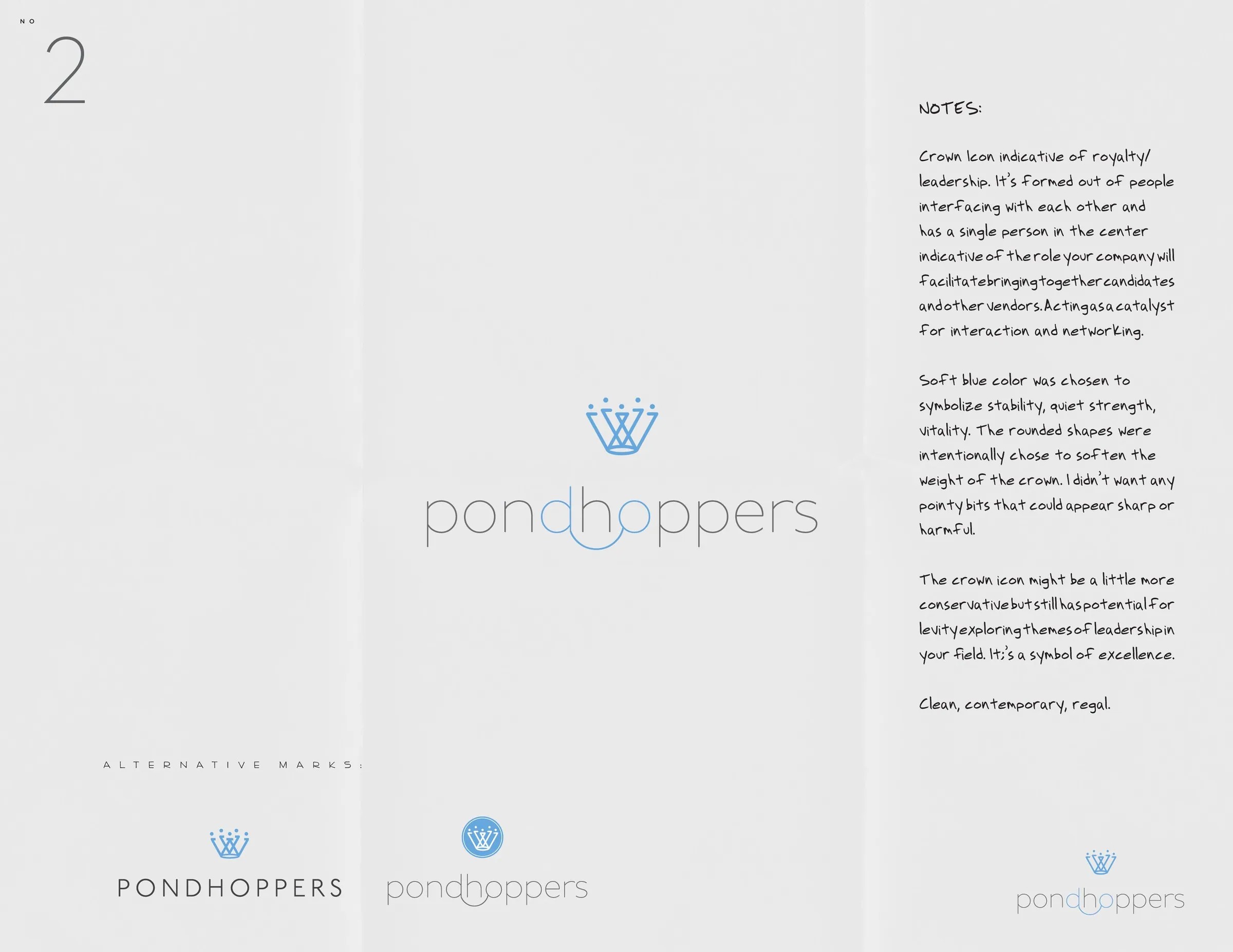
  7. Route two: a small crown of crossed lines above the wordmark in blue, with notes.
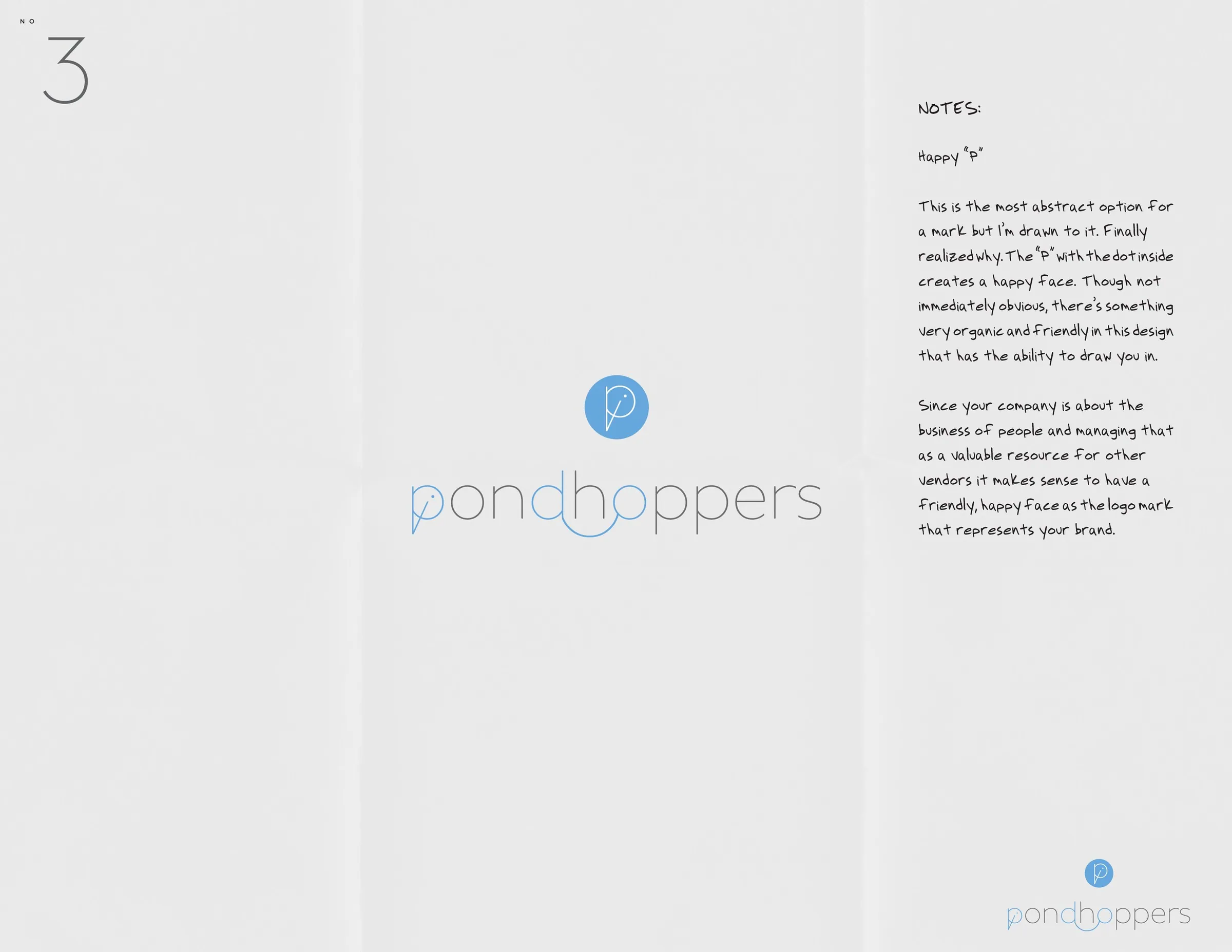
  8. Route three: a P in a blue disc above the wordmark, with notes.
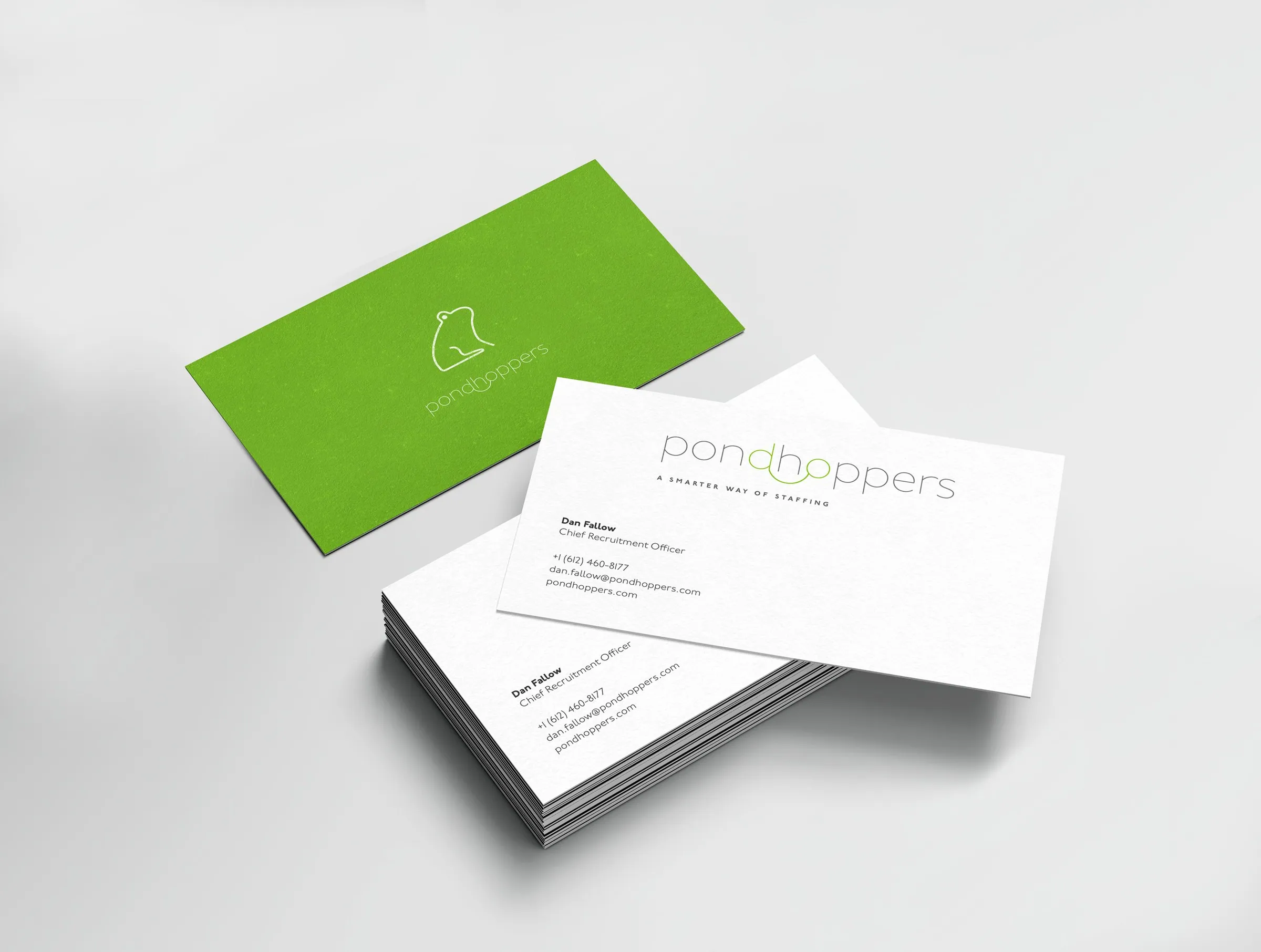
  9. Business cards: green backs with the frog, white fronts with the wordmark.
  10. A letterhead: the wordmark and frog centred at the top under a thin green band.
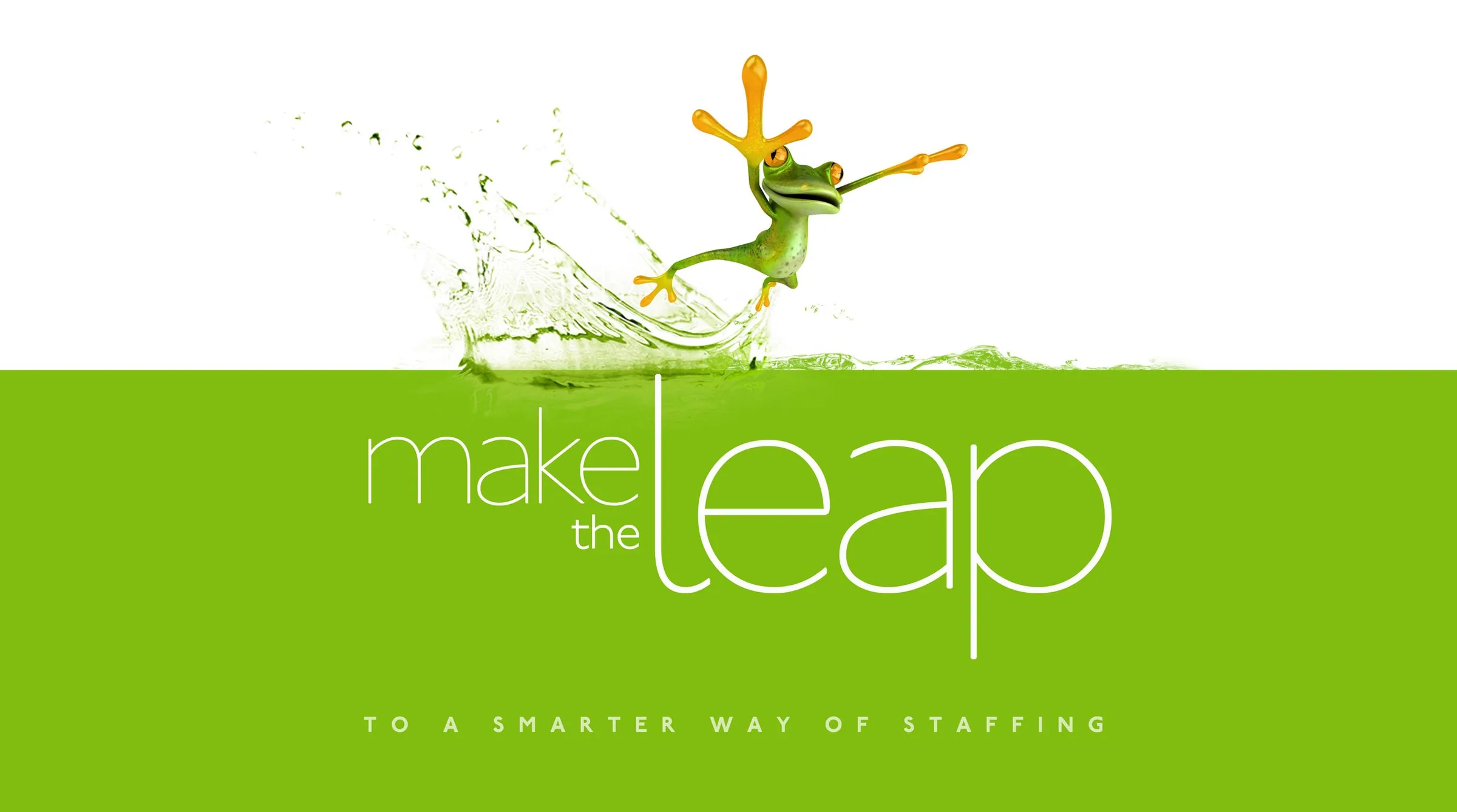
  11. A web banner: a cartoon frog leaps off a splash above a green band reading make the leap, to a smarter way of staffing.
  12. A cartoon frog chases a carrot dangling from a stick strapped to its own back.
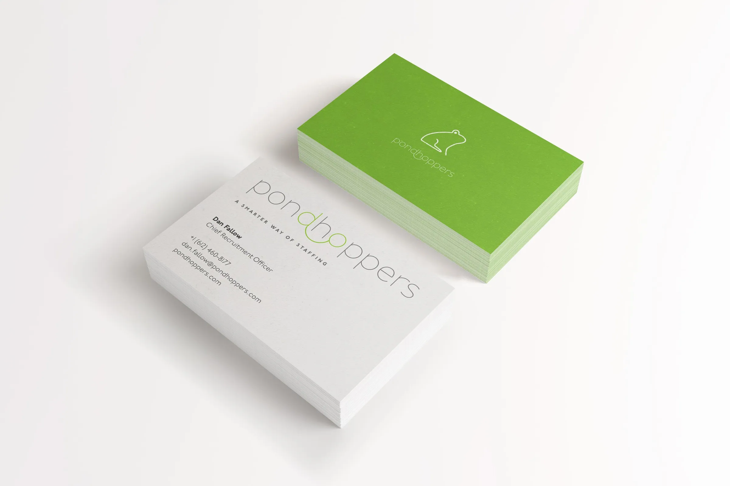
  13. A stack of white business cards with green edges, the wordmark on top.

Pondhoppers

01 / 13

Let’s talk.

Got a project that deserves this much looking at?

Start a project